Laptop Mag Verdict
Apple's OS X El Capitan is a smart upgrade, offering better performance, a helpful Split View mode and improved battery life in Safari.
Pros
- +
Split View multitasking
- +
Faster performance
- +
Much improved Notes app
- +
Longer battery life in Safari
- +
Metal graphics has great potential
Cons
- -
Can't close apps in Mission Control view
- -
Lacks Siri integration
Why you can trust Laptop Mag
Last year's OS X Yosemite software brought a modern redesign and new ways for iOS devices and Macs to interact. The new OS X El Capitan introduces a lot of smaller, but still important, improvements. For example, you can run two apps side by side (finally!), run Spotlight searches using natural language and enjoy beefed-up apps like Notes. However, the biggest changes in El Capitan are under the hood: a performance boost for everyday tasks and a new graphics engine.
Using a 15-inch MacBook Pro, I tested a final build of El Capitan to evaluate its various new features and performance. Overall, this free upgrade won't blow you away, but it will make you more productive and save you time, and the new Metal graphics have serious potential to soup up gameplay and help creative pros.
Split View: Multitasking Made Easier

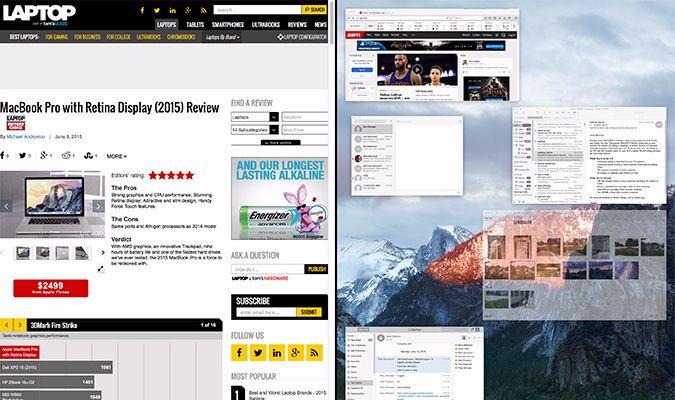
While Windows has had this feature for a while, Split View in El Capitan lets you run two apps side by side, whether you want to watch YouTube in one window while you surf the Web in another, or keep an eye on your email while you finish up a report.
To enter Split View mode, click and hold the full-screen button on the window you want to anchor. Another option within El Capitan is to drag an app window to the top of your screen to enter Mission Control, after which you drop it into the Spaces bar on top of another full-screen thumbnail.
I appreciated the ability to surf the Web in one window on the left and then drag and drop a link into the new Notes app on the right. It really saved me time. You can also easily resize the width of each pane using the slider bar in the middle, although one window would blur as I did that. I like that you can flip the position of each window by simply dragging it in the direction you want.
My beef with Split View is that it automatically defaults to a full-screen view of the two apps. Apple says this is an unobstructed view, but I don't like having to use the cursor to scroll down to see the dock or scroll to the top of the screen to see the menu bar. At least you can swipe sideways with three fingers on the trackpad to see your desktop and other Spaces you may have created.
It's also worth noting that Windows 10 supports up to four snapped windows at once, whereas El Capitan allows only two.
Mission Control: Clutter Be Gone
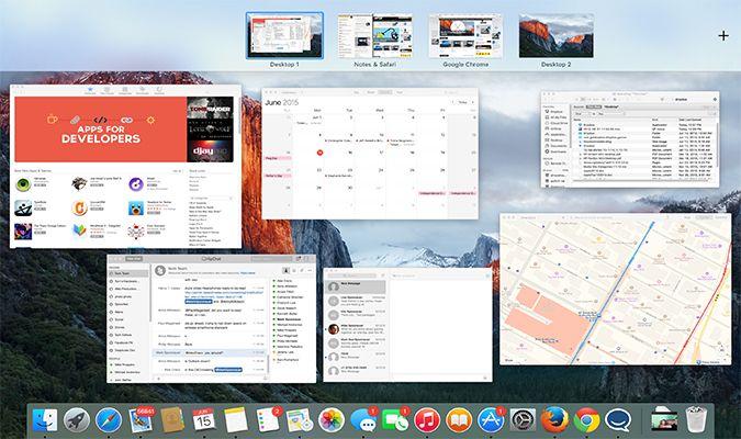
As someone who is awful about closing open apps, I often dread using Mission Control to manage windows, because multiple instances of the same app (like a bunch of Word docs) get piled on top of one another in a stack. In El Capitan, Apple has put everything on a single layer without any overlap, which makes items easier to find, especially if you're using a Mac with a higher-resolution Retina display. The OS is also smart enough to position apps in Mission Control based on where they were on the desktop.

To get to Mission Control, swipe up with three fingers on the trackpad, or press F3, just like before. But now, to let you see more of the thumbnails, by default, Apple doesn't display your Spaces (virtual desktops) across the top; there's just a list, and you can see what's in each space by bringing your cursor to the top of the screen.

If you add a desktop to the Spaces bar and then hover over it, an "X" will appear in the top-left corner of the thumbnail, allowing you to delete that desktop. Too bad you can't close Spaces or apps in the same way. I've been complaining about this for years, but no one has acted on my suggestion yet.
On the plus side, you don't have to worry about your cursor getting lost in Mission Control or when you have Split View open. Shaking your finger on the touchpad makes the cursor grow temporarily. Neat.
Swifter Performance, Especially for Power Users
El Capitan should give a kick in the pants to your Mac's performance. Apple says you should see 40 percent faster app-launch times, and up to twice as fast app-switch times, compared to in Yosemite. In addition, large PDF files should open more quickly.
We first put Apple's claims to the test by timing how long it took to switch apps in El Capitan versus in Yosemite, using the Command + Tab command on two identically configured 15-inch Retina MacBook Pros (2.2-GHz Core i7, 16GB of RAM, 256GB flash storage). The El Capitan system turned in a faster time of 21.25 milliseconds, compared to 45.75 milliseconds for Yosemite. That's not a huge time to wait, but it is more than twice as fast.
Next, we loaded a high-resolution PDF file (3276 x 235 pixels) on both of our test Macs to see how quickly they rendered. The El Capitan notebook took 284.5 milliseconds, and the one with Yosemite finished in 477 milliseconds -- a 67 percent improvement.
People with large photo libraries will appreciate how much quicker the Photos app now loads. With 28GB worth of images and videos loaded on our El Capitan and Yosemite Mac notebooks, the Photos app took 111.25 milliseconds to load on Apple's new OS, versus 200 milliseconds on last year's OS.
MORE: Best Mac Apps
In my experience with El Capitan, I saw smooth performance across the board, whether I was editing photos in Pixelmator or surfing the Web. Then again, I didn't see a difference in website load times between El Capitan and Yosemite. You'll get more benefit from the new OS X when you have bigger files and libraries to load.
Metal graphics technology has also come to the Mac in El Capitan, which should have a big impact on everyday tasks as well as resource-intensive ones. Apple claims Metal, first introduced on iOS, results in a 50 percent increase in rendering performance while improving efficiency by 40 percent.
The rendering enhancements Metal provides should bring benefits to both gamers and creative pros. During the Worldwide Developers Conference preview of El Capitan, Epic showed off the game Fortnite, which involved complex graphics and effects that ran smoothly. Apple says to expect up to 10 times faster draw-cell performance on higher-end games. Apple also boasts that users of Adobe After Effects will enjoy up to eight times faster rendering under El Capitan. We haven't yet tested those claims.
Battery-Life Boost in Safari
One of the first things I do when I test a new Mac is load Chrome, because I'm so used to Google's browser. But now I'm thinking twice. Apple promises that your MacBook's battery will last longer when you use the Safari browser in El Capitan compared to Chrome or Firefox, whether you're surfing the Web (up to 2 hours longer endurance) or watching Netflix (up to 4 hours longer).

For our test, we enjoyed a little binge session of The Office on Netflix, streaming for 2 hours and 15 minutes on both Safari and Chrome in El Capitan. We set our MacBook to 100 nits of screen brightness. After that time, when using the Safari browser, our Mac reported that it had 72 percent battery life and 5 hours and 35 minutes of power remaining, compared to 52 percent (and 2 hours and 18 minutes remaining) for Chrome under the same conditions. That's a huge difference in efficiency.
Souped-Up Safari: Pinning Sites, Silencing Annoying Tabs
The Safari browser's best new feature in El Capitan is Pinned Tabs, which are essentially live bookmarks for tabs. By Control-clicking on a tab and then selecting Pin Tab, you can dock it to the left side of the browser underneath the address bar. (It will show up as an icon.) This is very handy for users who visit a lot of the same sites repeatedly throughout the day.

If you hate it when video or audio mysteriously starts playing in a tab and you can't pinpoint it, Safari in El Capitan will prevent your blood from boiling. All you need to do is look for the audio icon in the address bar and click it. Or, if you want to silence one tab while you continue jamming out to Pandora or watching YouTube, you can locate the offending tab-playing sound by pressing and holding that audio icon. By contrast, Chrome lets you mute tabs, but not all of them at once from the address bar.
Smarter Spotlight: Natural Language Search But No Siri
The Spotlight tool in OS X just upped its IQ, and got more humanlike. Using natural-language queries, you can hunt items down on your desktop by saying things like, "Photos from May" or "Unread email from Anna" or "PowerPoints from this week." In my testing, these sorts of searches worked well, and they can be real time savers.
Spotlight can now also bring up a lot more info found on the Web, from the weather and sports scores to stock scores and even transit directions. Chances are, you'll use Spotlight more, and the good news is that El Capitan lets you easily change the position of the box on the page and open it to the same exact location on your screen.
What if you'd rather speak than type? Talk to your iPhone or iPad, because for now, you can't get Apple's voice-enabled assistant on your Mac. This seems like a missed opportunity to me, especially in light of Microsoft's Cortana efforts. Why not let people set reminders, look up directions, get the weather and more, without having to lift a finger?
Notes: Learning New Tricks
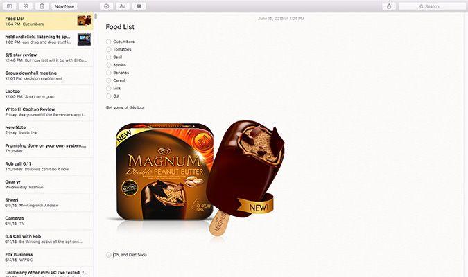
I've always been a little jealous of Evernote users and the features they enjoy, but I've stuck with Apple's Notes, mostly because it's included with OS X. Well, my laziness has paid off! With El Capitan, as with the updated Notes app in iOS 9, you can now use Notes to make bulleted lists (great for meetings or food shopping), as well as add everything from photos and videos to visual shortcuts to websites that have thumbnails.

You can drag and drop all sorts of content into notes, but you can also use the Share button within apps if you like. Say you're visiting a website that you want to use in a note. You hit the Share button, and then you can type the note and add it to a new note or an existing one by scrolling through a list. I wish El Capitan also let you search for notes from this Share menu. Apps that permit sharing to Notes other than Safari include Maps, Photos, Pages, Numbers and Keynote.
Other Notes highlights include a Photos button that provides quick access to your library, and a separate Attachments Browser button that lets you view your notes collection based on the attachments inside. I noticed some flickering in the Photos menu, but it's just an early bug.
Other Improved Apps: Mail, Maps and Photos
Apple's Mail app in El Capitan gets the same natural-language goodness as the Finder. For instance, when I searched for "Emails from Anna last week sent with attachments," I saw messages only from her with documents attached.
OS X also delivers a better full-screen experience. If you need to save a draft but don't want to go digging for it afterward, just click outside the compose window, and your draft will dock at the bottom of the screen for easy retrieval. In full-screen mode, you can compose multiple emails simultaneously by opening multiple tabs.

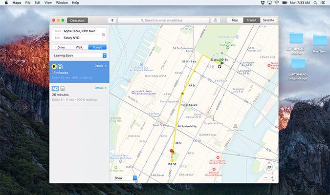
I don't use Maps very often on the desktop -- usually just to get a quick glance at where my next meeting is -- but it's nice to know that Apple has finally added public-transit directions along with a dedicated transit view. El Capitan supports 10 cities -- including New York, Chicago, Philadelphia and San Francisco -- with more on the way.
If you're running iOS 9, you can send directions to your iPhone from the Maps app on your Mac using Apple's Handoff features.
The new Photos app for OS X El Capitan brings a host of new features, such as adding a location to images or Moments. Apple also wants you to make Photos your first stop for all image handling, as the company is enabling editing extensions for developers to bring their tools and filters directly into the app, such as Pixelmator, MacPhun and BeFunky. You'll be able to download extensions from the Mac App Store, and some developers will include extensions bundled in their apps.
Bottom Line
Overall, OS X El Capitan is a welcome upgrade. The Split View multitasking alone is worth the download. I also like the smarter Spotlight search features and enhanced Notes and Photos apps. But all the performance enhancements Apple made are an even bigger deal. Every millisecond here or second there can really add up throughout your workday. Plus, if you're willing to use Safari as your main browser, you can save serious battery life.
El Capitan isn't flawless. I wish Apple had included Siri in OS X, instead of keeping it an iOS-only feature. (Microsoft brought Cortana to the desktop with Windows 10.) In addition, while I appreciate that Apple streamlined Mission Control, I wish you could close apps from this view. Nevertheless, El Capitan is a great tune-up for your Mac that will only get better as developers put their pedal to the Metal.
OS X El Capitan Specs
| Company Website | http://www.apple.com |
| Platforms | Mac OS X |
| Software Type | Operating Systems |

