Laptop Mag Verdict
Not only does OS X Yosemite have a flatter, cleaner look, but it also lets you transition almost seamlessly between Macs and iOS devices.
Pros
- +
Continuity features dramatically improve cross-device workflow
- +
Much-improved iCloud file-syncing service
- +
More-capable Spotlight feature
- +
Clean, modern appearance
Cons
- -
Some of best features require relatively recent hardware
- -
Pervasive translucency can make some UI elements confusing
- -
Finder's file-management features still feel limited
Why you can trust Laptop Mag
With last year's release of iOS 7, Apple made its mobile OS "flatter" -- the fancy, 3D textures of iOS 6 were replaced by brighter colors, simpler interfaces and less depth. With this week's release of OS X 10.10 Yosemite -- available for free from Apple's Mac App Store starting tomorrow (Oct. 16) -- the company has taken a similar visual approach with its desktop operating system. You'll find brighter colors, fewer textures and simpler-looking interfaces.
But Yosemite doesn't just adopt iOS's look. It also allows devices running either platform to integrate, share and collaborate. And while Apple has made innumerable other tweaks to OS X in Yosemite, and added some great new features, this Mac/iPhone/iPad integration will surely be the biggest appeal for many people invested in Apple's ecosystem.
Editor's Note: This review is based on the final beta of OS X Yosemite. Upon the operating system's official release, we will revisit any issues we encountered and amend this review accordingly.
Who Can Run It?
As with Mavericks, any Mac that can run OS X 10.7 Lion or later can run Yosemite. Even most OS X 10.6 Snow Leopard-compatible Macs are eligible, though specific features require newer hardware components. (More on those restrictions below.) The list of specific computers is:
- iMac (Mid-2007 or newer)
- MacBook (Late 2008 Aluminum, Early 2009 or newer)
- MacBook Pro (Mid/Late 2007 or newer)
- MacBook Air (Late 2008 or newer)
- Mac mini (Early 2009 or newer)
- Mac Pro (Early 2008 or newer)
- Xserve (Early 2009)
To install Yosemite, your Mac must already be running 10.6.8 Snow Leopard or later to download the new OS from the Mac App Store. Apple's other official requirements are 2GB of RAM and 8GB of available storage; I recommend at least 4GB of RAM and 10GB or more of free drive space; you'll simply have a better experience with those resources.
Interface: A New Look
More than with any previous update to OS X, Yosemite offers a significant visual overhaul. The system font is now the thinner Helvetica Neue; interface elements that formerly had texture or weight are now flatter and more colorful; gradients are subtler or have been eliminated completely.
Translucency is everywhere in Yosemite, in toolbars, sidebars and more. The translucent effect can be a bit distracting in some apps, for example, in Preview's sidebar. But in others, it helps you focus on the main content area, and it adds a feeling of depth to the otherwise flat design. (You can disable most transparent effects by going to System Preferences > Accessibility > Display, and checking the Reduce Transparency option; an Increase Contrast option makes many buttons and similar interface elements more defined.).
Apple simplified and compacted many window toolbars. For example, Safari's toolbar is now inline with the "Stoplight" buttons, and Contacts has lost its traditional title bar in order to conserve vertical screen space. Apple also revamped the icons for included apps, starting with a new, happier Finder, and you'll find that some elements, such as the Share button, are direct copies of their iOS counterparts.

Overall, Yosemite's look is quite different than that of Mavericks, but it makes Apple's desktop and mobile operating systems feel more like variations of each other. And after the initial shock wears off, Yosemite's look is actually quite nice, though the new system font works much better on Macs with a Retina display than on lower-resolution screens.
A minor, but nice option is the new Dark Mode (found in the General screen of System Preferences), which changes the background of the menu bar, Dock and Spotlight from translucent white to translucent black. It's a slick effect (and the nifty utility Lights Out can automatically enable and disable dark mode based on daylight hours). However, in the latest pre-release versions of Yosemite, I couldn't disable dark mode once I turned it on. (I presume this bug will get fixed in the final version.)

I also love Yosemite's new Dock, which dispenses with the odd, 3D version of recent years, replacing it with a flat, translucent background. The new appearance makes app icons much easier to see and differentiate, and the running-app indicator is more obvious. And if you like working with full-screen apps, the green-stoplight button on any window now toggles full-screen mode, further integrating this feature into the standard interface. (Option-clicking that button gives you the old-school "zoom" behavior.)
MORE: Apple OS X 10.9 Mavericks: Full Review
Overall, the look and feel of Yosemite is cleaner and feels more efficient. It will make for an easier adjustment for new Mac users coming from iOS, and I suspect that many OS X veterans will grow to like the new interface.
Continuity: Easier Multi-Device Workflows
Though Yosemite offers a slew of new features, a group of these features collectively dubbed Continuity is likely to be the biggest draw. This will be especially true for Mac owners who also use iOS devices, but even for those who just have more than one Mac.
Handoff
One of the biggest challenges to using multiple computing devices is moving your work from one to another, whether it's shifting the editing of a spreadsheet from an iMac to an iPad or starting an email message on your iPhone and finishing it on your MacBook. Yosemite's new Handoff feature lets you perform some of these shifts with much less hassle.
When using supported apps, you can save a document, pause editing of an outgoing message or stop reading a webpage on one device, and then pick that task up right where you left off on another. For example, when viewing a Web page in Safari on your Mac, you can turn on your iPad, swipe up on a small Safari icon that appears on the lock screen, and immediately view that same Web page in iOS Safari. You can also do the reverse, with a special Handoff icon appearing at the end of your OS X Dock to let you receive the Web page.
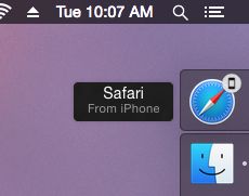
Apple says Handoff works with Calendar, Contacts, Keynote, Mail, Maps, Messages, Notes, Numbers, Pages, Reminders and Safari; third-party apps must be updated to support the feature. (Third-party developers will also be able to enable Handoff between iOS apps and Web apps on the desktop.) In my testing, handoffs in these apps -- except for the iWork apps, which require an update that will be released in concert with Yosemite -- usually worked as advertised. When it works, Handoff feels almost magical.
In the weeks leading up to Yosemite's release, Handoff's success rate was occasionally spotty. For example, on several occasions, I was able to stop writing an email or pause viewing a Web page on my iMac and immediately resume on my iPhone or iPad. But I couldn't reliably get it to work the other way around. (Apple says these glitches should be resolved in the final version of Yosemite.)
MORE: 6 Quick Ways to Secure Your MacBook
Handoff is also a bit finicky in terms of how you get it to work. For example, when moving from a Mac or iOS device to another iOS device, the receiving iOS device must be at the lock screen in order to receive the handoff; you end up having to lock your device's screen and then wake it up to complete the handoff.
AirDrop
People have also long been frustrated when transferring files between OS X and iOS devices. Apple's AirDrop feature, which makes it relatively easy to transfer files between devices, has been around for a while, but until now, it's been platform specific: OS X to OS X or iOS to iOS. With Yosemite and iOS 8, you can now use AirDrop to send files directly between compatible Macs and iOS devices.

On an iPhone or iPad, you use the familiar share sheet; on OS X, you use the Finder's AirDrop view. And unlike with older versions of OS X AirDrop, you don't need to first open the AirDrop view in the Finder to receive files. If someone sends you data using AirDrop, you'll see a standard notification, allowing you to accept or decline the transfer. Even better, if you're sending data to yourself -- from and to devices with the same Apple ID -- the transfer happens automatically, and you see a notification that lets you quickly view the new file(s).
As with Handoff, when AirDrop works, it's fantastic. However, I did experience occasions when, even with recent hardware (a Late-2013 iMac and an iPhone 6 Plus), devices weren't able to "see" each other. (As with Handoff, this bug should be fixed in the final version of Yosemite.)
Phone and SMS

Yosemite and iOS 8 also work together to let you use the cellular capabilities of your iPhone or iPad on your Mac. My favorite feature is that if your iPhone is on the same Wi-Fi network as your Mac, you'll see a notification on your computer whenever you receive a call on your phone; you can answer the call right on your Mac, using its speaker and microphone for the conversation, or quickly send an iMessage reply. (This also works between iOS devices, so you can answer phone calls on your iPad.)

It gets better. If you're looking at a restaurant's Web page in Safari, or a friend's card in Contacts, you can click a phone number to call right from your Mac, using your iPhone for the cellular connection. As long as your iPhone is configured with the same iCloud account, it just works.
A related feature -- and one I'm really looking forward to, but that won't be available until the release of iOS 8.1 -- is SMS relaying. As with phone calls, if your iPhone is within range of your Mac, incoming SMS and MMS messages will automatically be forwarded to Messages on your computer, and you'll be able to send those types of messages from your Mac.
Instant Hotspot
You've long been able to set up a personal Wi-Fi hotspot with OS X, which lets you use the cellular-data connection of your iPhone or iPad for Internet access on your Mac. But doing so has required first configuring the feature on your iOS device, and then manually connecting your Mac to the phone or tablet via Wi-Fi. With Yosemite's new Instant Hotspot feature, you configure the setup once, and from then on you can initiate and stop the hotspot right from your Mac's system-wide Wi-Fi menu, without having to touch your iPhone or iPad.
According to Apple, Yosemite manages data more efficiently when using Instant Hotspot, and it automatically disconnects and reconnects as necessary to preserve your iOS device's battery life. I wasn't able to test this feature, as Instant Hotspot requires iOS 8.1, which should be released shortly after Yosemite.
Limited Compatibility
The downside to these Continuity features is that they require hardware that older Yosemite-compatible Macs won't have. Handoff, Instant Hotspot and Mac-to-iOS AirDrop each require a 2012 or newer Mac laptop, a 2012 or newer iMac or Mac mini, or a Late 2013 Mac Pro; each device must have Bluetooth LE enabled.
MORE: 10 Best Mac Productivity Apps
On the iOS side, Handoff requires a Lightning-connector device running iOS 8 or later, and Instant Hotspot requires an iPhone or iPad running iOS 8.1 or later with cellular service that supports personal hotspots. (Mac-to-iOS AirDrop requires only iOS 7.) Similarly, making phone calls on your Mac requires an iPhone running iOS 8 or later with a cellular plan, and SMS forwarding requires iOS 8.1.
iCloud Drive: More Like a Drive
Yosemite brings a complete revamp of iCloud document storage. Under Mavericks and iOS 7 (and previous OS versions), the file-storage and -sync space you get with a free iCloud account was sandboxed -- securely separated, on a per-app basis. Each app could see only its own documents, and you could share files across devices only if a particular app had versions for each device. Now, in many respects, iCloud Drive is a lot like a simplified version of Dropbox.
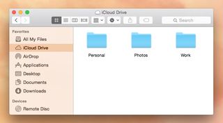
Once you enable iCloud Drive in Yosemite and iOS 8, which is initially an option, iCloud storage is much more open. For example, the Finder offers a special iCloud Drive view that looks just like any other folder, except that any files you store here are synced to your iCloud Drive space and, thus, to your other devices. Open that same view on another Mac, and you see the same files and folders; open an iOS 8 document-picker view on your iCloud Drive, and you'll see the same files and organization there, too. You can also access your iCloud Drive documents, and save to this area, using the standard Open/Save navigation dialogs.
Because the iCloud Drive view acts like a standard Finder folder, you can organize files however you want, including using tags; that organization is reflected across devices. Any changes you make while offline are automatically synced to iCloud once you're back online.
Developers can still choose to store an app's files in an app-specific folder, but it's no longer a requirement. And Apple is even updating its iCloud software for Windows to allow access to iCloud Drive from Windows.
MORE: 10 Laptops with the Longest Battery Life
Unfortunately, the new iCloud Drive features require Yosemite and iOS 8, and they're not backwards compatible with older versions of either platform. Once you enable iCloud Drive, you can no longer access iCloud Drive-hosted data on older devices. And data you save to iCloud on older computers and devices isn't accessible from Yosemite and iOS 8. For my testing, this meant that I wasn't able to rigorously test iCloud Drive's features across more than a few devices, but it seemed to work well in my limited use.
Spotlight: Front and Center
Apple says that Yosemite brings the biggest changes to Spotlight, OS X's system-wide search feature, since Mac OS X 10.4 Tiger. And that's a fair claim. For starters, Spotlight's main interface is no longer relegated to a corner of the screen, though its menu-bar icon remains there. Click that icon, or press a keyboard shortcut, and Spotlight's revamped search bar appears right in the middle of your display. Begin typing a search query, and you see both instant results and autosuggested search terms.
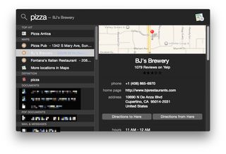
You can still use Spotlight to launch apps and locate documents; it actually feels a bit faster at these tasks than it did under Mavericks. But the new, larger interface provides room for detailed information, including maps, document previews and even Yelp reviews for businesses. When searching for a contact, you can see the person's entire contact card, and click on any bit of information to act on it: call a number, send an email, view a map and so on.
Spotlight also incorporates a number of additional data sources in Yosemite, including Wikipedia, Bing, Fandango, Maps, the Mac App Store, the iTunes Store and trending news from a number of websites, encouraging you to use Spotlight, rather than Safari, as your first option for searches.

Spotlight can use your current location when performing those sources: Search for "pizza," and Spotlight will show you nearby restaurants and ratings. Apple has also added unit and currency conversion: Type "3 tablespoons in teaspoons," and Spotlight shows you the answer, along with the same volume in several other units.
If you've rarely (or never) used Spotlight in previous versions of OS X, you'll want to give it a try in Yosemite. It's a much different, and much more useful, feature.
Notification Center: Mirroring iOS
In my experience, far fewer people use Notification Center on OS X than on iOS. But that could change under Yosemite, as the desktop version takes liberal cues from its mobile counterpart, making Notification Center just as much a replacement for OS X's legacy Dashboard feature as it is a center for notifications.
On the visual side, Notification Center now slides over your windows and desktop, rather than clumsily pushing the entire desktop aside. It's a much nicer effect, and one that's less disruptive. On the functional side, you get a Today view that mirrors the one found on the iPad and iPhone: a summary of today's weather and upcoming events at the top, with an editable list of widgets below, and a summary of tomorrow's day at the bottom.
Apple provides widgets for Calculator, Calendar, Reminders, Social (for quickly posting to Twitter, Facebook or LinkedIn, or for sending a text message), Stocks, Weather and World Clock. The Weather and Stocks widgets can even sync with their iOS counterparts. Once Yosemite is released, you'll be able to further customize the Today view using third-party widgets, such as a scoreboard widget from ESPN or Yahoo Sports, or a better calculator.
The other view, Notifications, works much as it did under Mavericks, as a sort of ticker-tape reference to past notifications. Alas, despite new visuals, not much has changed here. For example, there's still no way to quickly clear all notifications, and clearing each app's notifications still requires tapping a minuscule "x" button, one app at a time.
Safari: Streamlined Design
Like Notification Center, and perhaps more than any other standalone app, Safari in Yosemite has inherited much of the look and feel of its iOS 8 counterpart, or, more specifically, iOS 8 Safari on the iPad.
If you click in the URL/search field, you'll see a drop-down grid of icons for your Favorites. Open a new tab or window, and by default a similar grid of icons for your Favorites appears on the right, with your Bookmarks/Reading List/Shared Links list on the left. Clicking the tabs button in the upper right (or use a two-finger pinch gesture on your trackpad) shows a bird's-eye view of open tabs, grouped by website.
This new tab view even includes iCloud-synced open tabs from other devices. And Safari now has a shorter, streamlined toolbar, as well as a horizontally scrollable tab bar, just like on the iPad. The result is a browser that better fits smaller screens, leaves more room for Web content and makes it easier to quickly open your favorite sites.

On the other hand, this new minimalism has a few drawbacks. The new toolbar leaves no room for Web page titles, so if you want to see the name of the current page, you must have the tab bar visible. And, as with iOS, Safari by default shows only the root of the current webpage's URL (www.laptopmag.com, for example). To see the full URL, you must click the URL (or, to always see full URLs, enable the "Show full website address" option in Safari's Preferences). I'm not a fan of the new Favorites bar, either, which centers your favorites So, if you resize your Safari window, the location of each site's shortcut changes, eliminating the benefits of muscle memory.
Apple has extended much of Spotlight's Web-focused functionality into Safari's search bar. For example, type a search term, and the first result is often a preview of Wikipedia's article on the topic; enter a restaurant's name, and you see a Maps preview of the business; type "Movies," and a small preview of movies playing nearby appears.
Other minor changes include integration of third-party sharing extensions. For example, you can add a Tumblr option to Safari's Share menu. Also, you can now have separate private and nonprivate browsing windows (previously it was all or nothing), and Apple has restored RSS functionality to Safari. However, in Yosemite, subscribing to a site's RSS feed includes new articles in the Shared Links list, rather than in a traditional RSS-reader view.
A new feature called Quick Website Search lets you search specific sites by typing, for example, "youtube funny movie." Finally, your browsing history is now synced across all your devices, so it's easy to go back to a particular site, even if you last viewed it on your iPhone.
MORE: 5 Great Mac Accessories for Apple Fans
Chrome has become quite popular on OS X, but the Yosemite version of Safari offers enough interesting features, including many features Chrome has long had, that it will be easier than ever to stick with OS X's stock browser.
Mail: Better Attachments, Fewer Bugs
System-wide aesthetic changes aside, Mail in Yosemite looks and feels much like it has in the past couple versions of OS X. However, it gains two big new features that are sure to please those who frequently work with attachments.
The first, Mail Drop, makes it easier to send large files via email. Many email providers, including Apple's own iCloud mail service, impose size limits on message attachments. The common workaround has been to sign up for an online-storage service (such as Dropbox or Droplr), upload your large file(s) to the service and then get a download URL you can send to your recipient.

In Yosemite, you simply drag large attachments into an outgoing message as you normally would. OS X automatically encrypts and uploads the attachments, up to 5GB per email message, to your iCloud storage on Apple's servers. (Mail Drop uploads don't count against your iCloud storage capacity.) If your message is received by another Yosemite user, the attachment(s) are automatically downloaded and appear in the message as would any other file. Users of other operating systems (including earlier versions of OS X) and webmail will instead see a link to download the file(s); these links are valid for 30 days.
As long as you have an iCloud account configured on your Mac, Mail Drop works with any email account set up in Mail -- not just iCloud mail. It's essentially seamless, and is an elegant solution to an issue that's become more and more common as file sizes for videos, photos and other sharable content have grown.
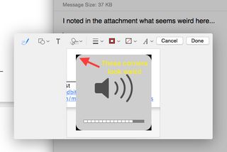
The other new feature, Markup, makes it easier to annotate PDFs and images. When replying to an email with a PDF or image attachment, a small Markup menu appears on the image; click it, and you get tools for editing that document. You can draw free-form and straight lines, arrows and other shapes; magnify parts of the image; add text; add a signature; and more. You essentially get all the annotation tools built into OS X's Preview app right from within Mail. It's the most convenient solution I've seen for signing PDFs and quickly adding notations to images.
If you were scarred by Mavericks' early Mail problems, you're probably wondering if Mail in Yosemite is better. I couldn't test Yosemite Mail with an Exchange server -- one of Mavericks Mail's buggiest areas -- over several weeks using release candidates of Yosemite. But Mail seems to be solid when used with iCloud, general IMAP and even Gmail accounts. Unlike with early versions of Mavericks, I didn't have problems with mail not appearing (or messages disappearing), or issues connecting to my various email servers.
Messages: Learning from Mobile
The promise of Apple's Messages app and iMessage service has long been "all your instant and text messages, on every device." The reality has often been frustratingly far from that, but if you're running Yosemite and iOS 8, it's getting a lot closer, and the Messages app on OS X is becoming more and more like its iOS 8 counterpart.

Click to EnlargeFor starters, each conversation -- individual or group -- gets a new detail view that lets you share your location, see the locations of other participants (assuming they're on Yosemite or iOS 8 and have chosen to share where they are), and quickly view all media and documents included in the conversation. You can also rename group conversations for easier reference, easily add a new person or remove an existing participant, and even remove yourself from the conversation if you're done. If a particular conversation is getting a bit chatty, you can disable notifications for it.
Like iOS 8 Messages, the Yosemite version also lets you quickly record and send audio messages using a feature called Soundbites: Just click the microphone button next to the new-message field and start talking. Click stop, and you have the option to Send or Cancel.
MORE: Best Mac Antivirus Software 2014
Unfortunately, there's no way to preview the message, and audio quality isn't great, but it's still useful for times when you'd rather talk than type. Assuming the new SMS-relay feature described above works well once iOS 8.1 is released, Messages could finally be your one-stop messaging app on the desktop.
Family Sharing and More...
These are just the marquee new features and capabilities in Yosemite. Minor changes and adoptions of new iOS features abound. For example, Yosemite now supports Family Sharing, Apple's new option for sharing media, apps and other digital media across multiple Apple IDs. The Finder gains the capability to batch-rename groups of files. And the Calendar app makes it easier to quickly create new events; it also learns from past events to help auto-complete new ones. As with most new versions of OS X, you'll find little changes everywhere.
Bottom Line
Each year, Apple announces a new version of OS X, usually proclaiming the release to be the largest update yet. But OS X 10.10 Yosemite really does feel, and look, like it's worthy of the hype, especially if you own multiple Apple devices. It's the first version of OS X that truly embraces Apple's ever-widening ecosystem by letting you use your Macs, iPhones and iPads as part of a coherent computing system, rather than as disparate devices fighting for your attention. And for iOS users who are new to the Mac, Yosemite makes the transition from mobile to desktop (and back again) as seamless as I've seen to date.
I'd still like to see the Finder, and OS X's file-management features as a whole, get the overhaul they deserve, so that both basic and power users can work more efficiently. (Open and save dialogs, for example, haven't changed much in years.) It's also a shame, if technologically understandable, that so many of the best features of Yosemite require newer hardware, on both the Mac and iOS side. And like any new OS, Yosemite's initial release has a few glitches. But Yosemite will likely change -- for the better -- how many users work every day.
Apple OS X Yosemite Specs
| Company Website | www.apple.com |
| Disk Space | 8GB |
| Platforms | Mac |
| Required Processor | 2.4GHz Intel Core 2 Duo processor or higher |
| Required RAM | 2GB |
| Software Required OS: | OS X 10.7 or higher |
| Software Type | Operating Systems |
