10 Biggest Gadget Design Fails
A fair number of companies that read our product reviews tell me that they take our criticism to heart to improve their wares. That's flattering to hear, but I don't think the message is getting to the right people. How do I know? Companies continue to send us new laptops, tablets and smartphones that exhibit the same annoying design flaws over and over. Consider this list a polite but forceful intervention.
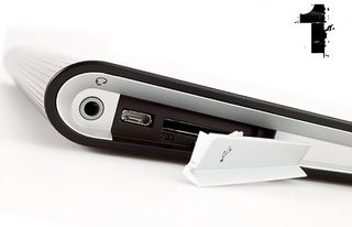
1.Port Flaps and Covers
Imagine if your car's ignition had a protective cover around the keyhole. Why? Exactly. I can understand if you're targeting the military, field workers or outdoor adventurers who need a device that can withstand water splashes and dust storms. But otherwise there's no need to cover up that microUSB port — or any other port — with a flap. It just gets in the way. Every time I see a covered port, I instantly take points off the review. The only pardonable exception is covering slots people rarely, if ever, access, like SIM cards.
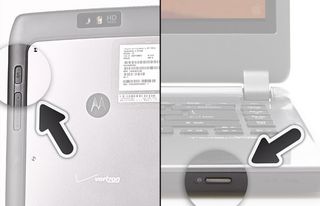
2. Let's Play 'Find the Power Button'
If it takes you more than 5 seconds to find the power button on a laptop or other gadget, the designers have failed. I've seen too many notebooks with the button on the front, which is not only unintuitive, but makes it too easy to accidentally turn off your system when it's sitting in your lap. Motorola placed the power button for its Droid Xyboard 8.2 tablet on its back, which amazed me because everyone ridiculed the original Xoom slate for this very issue. And here's a note to makers of smartphones with larger-than-life screens. Make sure you put the power button on the right instead of up top so we don't stretch our fingers out of our sockets.
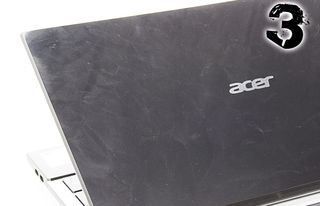
3. Fingerprint Magnets
There's nothing that looks cheaper than a tablet, laptop or phone that smudges up with fingerprints within a few minutes of picking it up. Typically, an overly glossy plastic surface is to blame. Metal designs tend to fare better, but not all are created equal. I'm actually encouraged by some of the latest unibody plastic designs, which not only resist fingerprints, but look thoroughly modern. The Nokia Lumia 900 is a good example. I'm also a fan of soft-touch finishes, found on devices like the Dell XPS 15. As for the screen, better designs employ an oleophobic coating to ward off fingerprints, such as the iPad.
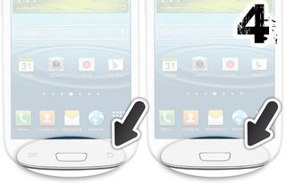
4. Dim or Disappearing Buttons
I'm definitely not a fan of phones whose buttons literally disappear after a few seconds, like the Back and Menu buttons on the Galaxy S III. Yes, it's a cleaner look, but operating a gadget should never feel like guesswork. The Sony Xperia ion also annoys me, because its four silver menu buttons are not only small, but also very dim. Providing a backlight underneath the buttons doesn't count; you need to backlight the buttons themselves.
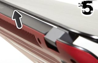
5. Creaky, Catch-prone Laptop Hinges
There's nothing you do more often than lift the lid on your laptop, so you better make sure that this operation is smooth. Unfortunately, I've seen a fair number of thin Ultrabooks whose lids either creak when opening — or worse — literally catch on the bottom part of the clamshell on the way up. Both the HP Envy 4t and 6z exhibited this troubling design flaw in our testing
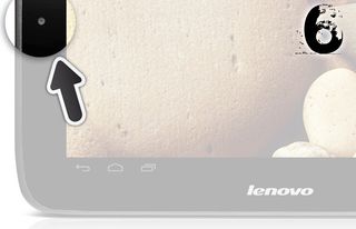
6. Awkward Webcam Placement
If you put your company's logo across the bottom of the device so that it's legible in landscape mode, but then you put the front-facing camera off to the left, that's a problem. That's exactly what Lenovo did with the IdeaPad S2109. It's as if the designers couldn't decide how the device should be held, which is strange because Google's Android software is optimized for the landscape orientation. Archos' 70b suffers from the same issue, though it's more forgivable on a 7-inch device that will be used in portrait mode at least some of the time.
Stay in the know with Laptop Mag
Get our in-depth reviews, helpful tips, great deals, and the biggest news stories delivered to your inbox.
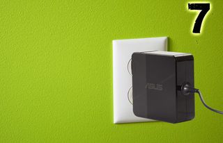
7.Short or Fat Power Chargers
Here’s an area of design that doesn’t get enough attention. I detest power bricks for laptops that take up so much room that you can’t plug anything else into the same outlet. For instance, the Asus UX32VD comes with a rectangular power adapter that takes up enough room to hog three spots on a power strip. Just as bad, the cord on this laptop is too short, which means you’ll have to sit close to the wall if you’re low on juice. Plenty of tablets and smartphones also come with power cables that are too short. For instance, it’s hard for me to plug the iPad in behind the couch without feeling like I’ll accidentally unplug the slate while using it.
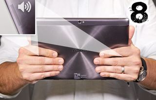
8. Bad Speaker Placement
It might surprise some of you laptop makers to know that people actually use these things in their laps. I know, it's nutty. And when that happens, the speakers you put on the bottom of the machine get muffled. Put them up top or underneath the keyboard if you're trying to make it superthin. Meanwhile, a lot of tablets place their speakers on the back edges, exactly where it's all too easy to block the sound with your fingers. Better-designed slates feature front-firing speakers, like the Samsung Galaxy Tab 2 10.1.

9. Function Key Combos
I can count the number of people I know who actually use Function keys on Windows laptops with one finger. So why do laptop makers continue to force people to perform annoying key combinations to do something as simple as adjust the volume or brightness? Apple has been doing this the right way for ages, but some other PC companies have finally gotten the message. Kudos to HP and Dell for including direct action keys on some of their machines. Acer, ASUS, Sony and Lenovo are still behind the times.

10. Faux Metal Jackets
Look, I understand the desire to make your cheap design look premium, but don’t attempt to fool customers into believing that your gadget is metal when it’s not. The back of the LG Viper for Sprint, for instance, has a back that’s plastic, but it’s painted to look like brushed metal. I’ve seen plenty of tablets and laptops that do this, too. Some notebooks have real metal on the lid and faux metal on the inside to create a unified aesthetic, but to me, it’s false advertising.
