7 Ways Apple Should Fix iOS 7
Apple’s iOS 7 is absolutely gorgeous. It’s also a lot more versatile than iOS 6, letting you multitask and tweak settings with ease. Add in seamless file sharing with other iDevices and it’s easy to see why nearly 60 percent of users upgraded in the first week. On the other hand, many have complained of sluggish performance (especially on older devices), shorter battery life, and even seasickness from some of the new visual effects.
The beauty of iOS 7 is that Apple can roll out updates as it sees fit. In fact, the company has already issued two updates addressing various bugs. But those are just bugs. Here’s what should really be on Apple’s to-do list.
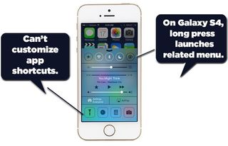
Make Control Center More Versatile
At last, iPhone and iPad users can toggle Wi-Fi, adjust brightness and more from a single menu. Just swipe up from the bottom to reveal the new Control Center. You can even control your music from this new tool. However, there’s plenty of room for improvement. Although you can easily turn Wi-Fi and Bluetooth on and off, you still need to open the separate settings app to connect to a new network or pair a device. Apple should let users access these menus by long pressing their respective buttons, which is exactly what the Galaxy S4 lets you do. While Apple is at it, it should allow users to customize the app shortcuts for the bottom of the screen. At least for now, you’re stuck with Flashlight, Clock, Calculator and Camera. I’d much rather have a shortcut to the Settings menu than an easy way to crunch numbers.
More:Apple iOS 7 Tips and Tricks
Lose the Cute Animations
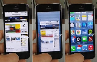
Within a few seconds of using iOS 7 I experienced something I never had before during a year with iOS 6: lag. Why? A new animation that shows icons flying onto your screen when you unlock your device or exit apps slows things down. Apple lets users reduce the motion of the user interface, including the parallax effect that some claim are making them queasy. But you should also have the option to turn off this and other time-wasting animations.
More: Apple iPhone 5s vs Samsung Galaxy S4
Let Users Choose Default Apps
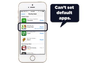
Apple will probably never let this happen, but it doesn’t hurt to ask. Say you’re sick of the Maps app not having public transit directions. Instead of recommending third-party apps, as iOS 7 does now, let users to choose which apps they would like to load by default, whether it's Google Maps or Waze. I mostly like the new Safari in iOS 7, but I should be able to make Chrome my default choice.
Stay in the know with Laptop Mag
Get our in-depth reviews, helpful tips, great deals, and the biggest news stories delivered to your inbox.
More: 25 Best iOS 7 Apps
Add Offline Voice Typing
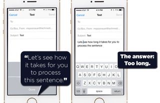
If you haven’t tried to use Apple’s dictation feature in iOS 6, I have some bad news. iOS 7 works exactly the same way. You press the microphone icon, speak and then wait for your words to ping Apple’s servers and then pop up on your screen. If you happen to have a weak cellular connection, the wait can be excruciating. Sometimes, I just wind up canceling dictation and typing instead. With Android’s offline voice typing, your words appear on the display almost as soon as they’re spoken, saving you time.
More: How to Change Siri's Voice
Don’t Cut Off Pictures in Photos App
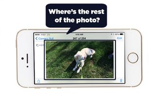
If you open the Photos app in iOS 7 and start scrolling through your camera roll, you’ll notice that the background is now white instead of black. That would be okay if the app actually showed all of your images. To do that, you’ll need to tap on the picture first, at which time the background will turn black. Why add this extra step to see your whole shot? The good news is that if you tap on a picture and then start scrolling through, the black background will stay and you’ll see all of your photos.
More: 5 Reasons Not to Upgrade to iPhone 5s
Streamline Notification Center
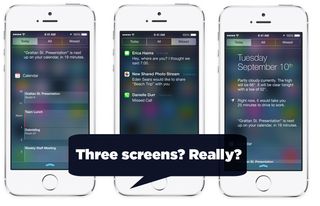
iOS 7 has a revamped Notification Center that’s split into three tabs: Today, All and Missed. The Today view is fairly useful, but Apple takes up too much space to present very little info. The date, weather and one appointment take up more than half of our screen. Meanwhile, it’s not clear why there’s a need for separate All and Missed notification tabs. Why not just combine them?
More: 1o Ways Android Beats iOS 7
More Sharing Options, Pronto
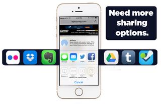
Right now if you go to share an article in Safari you’ll see exactly two social networks for sharing: Facebook and Twitter. The Photos app adds Flickr to the mix. That’s not enough. I can understand why Apple doesn’t want to embrace Google+ and its 300 million registered users as a sharing option, but I don’t have to like it. I’d also like iOS 7 a lot more if I could share via LinkedIn, Pinterest and other services. With Android, the choice is yours. Given that OS X Mavericks offers LinkedIn integration, at the very least Apple should bring this network to its mobile software.

