Hands-On With Kindle for Android

Yesterday Amazon finally brought Android phones into the fold and released the Kindle app to the Market. Android users can now enjoy the same features and functionality that iPad, iPhone and BlackBerry owners have been enjoying for a while, including bookmark and last page read sync. So no matter which device you decide to use, you'll always pick up where you left off.
Though the Android app is the newest of the bunch, Amazon didn't give the app a major overhaul for its new digs. The app is almost identical to what we found when we reviewed the iPhone version except for tweaks to work with Android architecture.
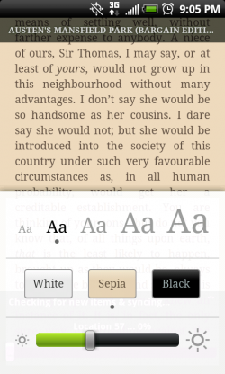
The reading experience remains good even though this app doesn't offer much in the way of customization. I settled on the Sepia color scheme, but only had three to choose from overall. The white background/black text choice is familiar, though a bit overwhelming on the eyes after a while. I didn't find the black background/white text option all that much easier to read, especially when I made the text size smaller. Sepia was the best compromise, and the brightness options also helped cut down on eye strain.

There are only five text sizes available -- which is plenty for a small screen -- but no font, margin, or line spacing options, so users can't tweak the reading screen to their liking. I personally like that the text fills the screen almost to the edges because it means less page turning, but I know not all readers like this arrangement.
A tap at the center of the screen reveals or dismisses the title and progress overlay. Tap the menu button to access other options: Go To page, Bookmark, Sync, and Font/Display Options. Swiping right or left turns pages, as does tapping at the edge of the screen. No fancy animations here, just a smooth left or right slide of the screen, just as with the iPhone app.
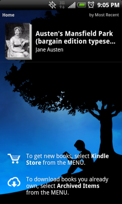
The Library navigation is equally simple. Users can sort by most recently downloaded, title, or author, but nothing else. The only browse view is in list format, with the book cover, title and author showing.
One aspect I'm not fond of is that the Kindle store doesn't launch within the app but instead uses the default browser. This isn't as annoying as I found it on the iPhone 3GS since Android multitasks, but I prefer to keep the whole experience in the app.
Stay in the know with Laptop Mag
Get our in-depth reviews, helpful tips, great deals, and the biggest news stories delivered to your inbox.
While I would have preferred that Amazon step up their game with this newest app, at least it offers the same functionality and immersive reading experience as the iPhone counterpart. Going by apps alone, I wouldn't choose Amazon's to start my eBook collection. But existing Kindle owners will appreciate having more devices at their disposal.
Check out our screenshot gallery below.
