HP Says BlackBerry PlayBook Imitates webOS, RIM Responds

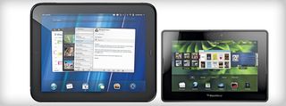
There's no denying it. RIM's first tablet, the BlackBerry PlayBook, looks pretty darn similar to HP's TouchPad. Yes, the PlayBook has a smaller 7-inch screen, compared to 9.7 inches for HP's slate. But the BlackBerry Tablet operating system (powered by QNX) certainly looks as if RIM may have taken a page out of the webOS (ahem) playbook. Both tablets render open programs as cards that you can easily swipe through for multitasking, and you can close apps using both OSes by swiping them off the screen. To be fair, though, RIM goes further with gestures in the PlayBook than HP does with its tablet.
Consumers might not care about these similarities, but what about HP? We asked them to comment, and as you might expect HP is flattered. We also reached out to RIM to get their perspective. Check it out below and let us know what you think.
HP on the BlackBerry PlayBook. Jon Oakes, director of product marketing, TouchPad
From what we’ve seen in the market, there are some uncanny similarities. It’s a fast innovation cycle and a fast imitation cycle in this market, so we just know that we have the creative engine here to continue to build on what we have, and we’ll keep innovating, we’ll keep honing and those guys hopefully will continue to see the value in it and keep following us by about a year.
RIM's response. Jeff McDowell, senior vice president for business and platform marketing
I feel that we set out from the ground up to define a user experience that we felt would delight our customers, and we landed in a place that may look like other competitive devices. But there was no intention and no preconceived notion that this is what we want to end up looking like. In fact, I think QNX had that design lined up before we even started working with them. You know, cars over time end up looking a lot alike because you put them through a wind tunnel, and when you’re trying to come up with the best coefficient to drag ratio, there’s one optimized shape that gets the best wind resistance, right? Well, when you’re trying to optimize user experience that juggles multitasking, multiple apps open at once and on a small screen, you’re going to get people landing on similar kinds of designs.
So what do you think? Sound off in the poll below or in the comments.
[polldaddy poll=4641484]
Stay in the know with Laptop Mag
Get our in-depth reviews, helpful tips, great deals, and the biggest news stories delivered to your inbox.
