Google has officially released its new YouTube application on the Apple App Store, in a move that remedies the omission of the previous YouTube app from Apple's upcoming iOS 6. The new app is completely redesigned, faster and (surprise, surprise) ad-supported. But with these ads comes a plethora of additional content previously unavailable in the older version of the app.
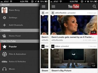
Forget the navigational tiles at the bottom of the screen. Instead, the YouTube App employs side navigation, similar to the mobile apps for Facebook, Path and Google+. The side navigation is accessible by swiping to the left from the home screen or pressing the navigation button in the top left corner. From this menu, you can navigate to different channels, view favorites or adjust settings.

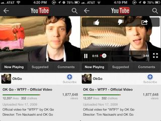
The video viewing screen has also improved over previous versions. When viewing YouTube in portrait mode, the video no longer takes up the entire screen when playing. Users are able to simultaneously watch a video and view the video details, view comments and browse suggested videos. Additionally, entering full-screen mode now automatically orients the video to landscape view, even with portrait lock enabled.

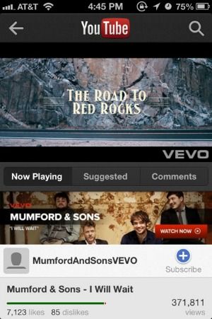
The new YouTube application will show banner and video ads, similar to the full website, but with these ads comes additional content. Music videos make up a large potion of YouTube.com's traffic, and now premium content, from VEVO and others, will be available on mobile devices. Much as users have adjusted to advertising online, mobile ads for YouTube videos may be a welcome trade-off for such a large amount of free content.
- Top 10 Smartphones
- Dijit NextGuide for iPad: Social TV Discovery Done Right
- 11 Things You Need to Know About the iPhone 5
Stay in the know with Laptop Mag
Get our in-depth reviews, helpful tips, great deals, and the biggest news stories delivered to your inbox.
