Notebook Design 101: Touchpad Do's and Don'ts
One of the most fundamental aspects of notebook or netbook design is the touchpad. Aside from the keyboard, it's the one area where users have the most physical contact with a system. And yet, we're amazed at the fact that notebook makers continue to produce touchpads that mar the overall experience. So, here's a primer on touchpads and buttons that work, and ones that don't. While our opinions are, by nature, subjective, there are a few universalities that we think all notebook makers should heed.
1. Make 'em big.
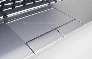
There's nothing worse than a small touchpad, and a small laptop should be no excuse. Take, for example, the Toshiba NB205: This 10-inch system has a touchpad that's 3.1 x 1.6 inches, by far the largest we've seen on a netbook, and larger than on a number of full-size notebooks.
2. Split up the freakin' buttons.
Stay in the know with Laptop Mag
Get our in-depth reviews, helpful tips, great deals, and the biggest news stories delivered to your inbox.
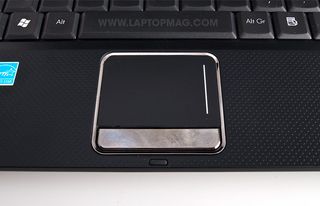
With few exceptions, we've rarely liked the single-bar-as-button design. Many times, it results in buttons that are either too soft or too hard to press, and there's more of a chance of you hitting the wrong one if you're not looking at the notebook. Which brings us to another point...
3. Buttons go below the touchpad.
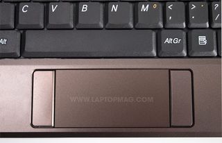
This just doesn't work.
4. Hold the friction.
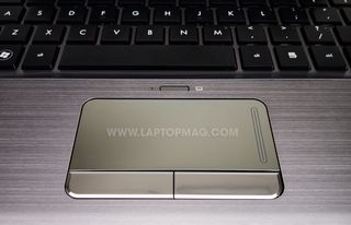
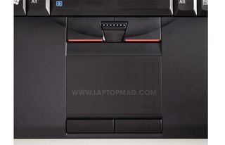
Nothing ruins a computing experience than having to repeatedly swipe a touchpad just to make it across the desktop. Ironically, a touchpad that's too smooth causes too much friction, making it impossible to move your finger without effort. Something silvery and shiny may look cool, but loses points to more pedestrian, but useful, touchpads such as those found on Lenovos:
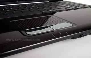
And it's ok being innovative. ASUS' touchpads are dimpled, which not only looks different, but helps cut friction, too.
5. Make sure it, you know, works.
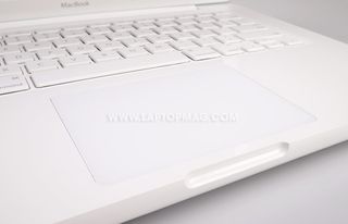
Only one company has got the integrated mouse-button touchpad right, and that's Apple. Not only is the touchpad on the MacBooks and the MacBook Pros positively large, but it seamlessly integrates the mouse button into the design, and allows for multitouch gestures, too.
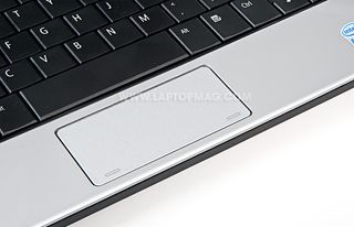
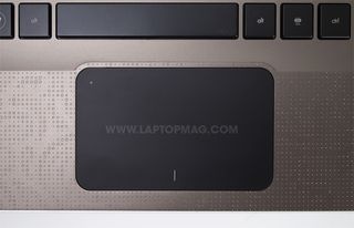
Both Dell (with the Inspiron Mini 10) and HP (with the Envy 13) have tried similar approaches, but both were marred by poor software that caused the cursor to jump around the screen erratically whenever you had more than one finger resting on the pad. However, Dell has improved its netbook with updates, and HP promises that it has upgraded its Envy since our review.
So, what touchpads work for you? What's your favorite? What's your least favorite?
As featured on "Into Tomorrow...with Dave Graveline", airing Friday, November 6!
