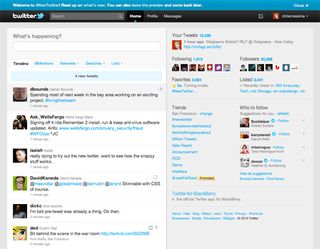
Twitter Launches Revamped Site With iPad-Like Design

If you tweet it, they will come. Twitter unveiled a refreshed version of Twitter.com on Tuesday that adds embeddable images, videos, and other media to the simple interface users have known since the service launched in 2006. The new page layout, with two large columns for updates and extras, takes many cues from Twitter for iPad--the native Twitter client for Apple’s tablet.
Even with more bells and whistles, the design remains relatively simple. The left column features the standard updates users have been accustomed to for awhile. When you click an update in the left column, additional information, as detailed profile points, appears in the right column. Users can also view media from 16 different partners, such as YouTube, Vimeo, TwitPic, and yFrog, in the right column.
The new design will be rolled out to users over the next few weeks, so many users don’t have access yet. For those that want to see more photos, Chris Messina, a Google employee, has a full set of a “New Twitter” photos on Flickr. To see more reactions to the site changes from users, go to search.twitter.com and search for #NewTwitter.
What do you think of the new redesign? Please vote in the poll below to let us know!
Stay in the know with Laptop Mag
Get our in-depth reviews, helpful tips, great deals, and the biggest news stories delivered to your inbox.
