Why the Browser's Not Safe For (Real) Work

With more and more applications moving into the cloud, the old republic of installed software is in danger of falling. A new online empire promises security, stability, and even portability, but at its head is an evil emperor, the web browser. This is how productivity dies, with thunderous back buttons and multipurpose address bars.
Search your feelings; you know it to be true. Do you really want to compose all your documents in an application that erases your work if you accidentally hit the backspace key one time too many?
I think we need a prequel to explain what's really going on here. Like most villains, the browser started out life innocently enough. Back in the early 90s, at a time when universities and other large institutions were the only ones with Internet access, the World Wide Web was just one of several competing Internet protocols students and researchers used to share information.
Back in those days, when I was trying to decide whether to put my college literary magazine up as a Gopher site or a Web site, nobody expected the browser to become the center of the computing experience. With a UI that was and still is based on a book stack metaphor--pages, universal resource locators, bookmarks, links--the browser was meant to be your digital librarian, not your application shell. It's that research-library legacy that makes even the latest browsers unsuited for serious content creation, no matter how good their web apps are.
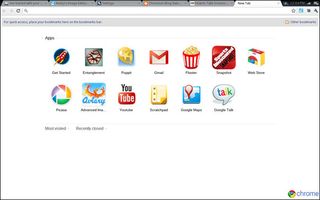
The goal of a content application, whether it's Microsoft Word or Adobe Photoshop, is to help you edit files, whether those are documents, images, or C# programs. While you are working on a piece of content, the menus you need to edit that piece of content (and others you may have open) should dominate your experience. But if you look at the top of any browser—even the screen in Chrome OS—you'll see several navigation elements that are designed to drive you away from your document. You have an address bar you can type into, a bookmarks menu to quickly shuttle you off to another place, and worst of all, a back button.

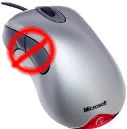
The back function includes not only the back button itself, but also a wide range of shortcuts that can accidentally pull you out of an editor window. If you've spent any amount of time typing into a web form, you've probably had the experience of hitting backspace to erase some text and watching helplessly as the browser returned to the previous page and wiped out your work. This keyboard "shortcut" is only meant to activate when you aren't typing into a textbox, but there are so many times when you think a textbox has focus but it doesn't. You've probably also lost work by accidentally hitting the thumb button (for back) on your mouse.
While some browser-based editors such as Word Press deal with the back-out problem by giving you a confirmation dialog box that makes you hit OK to leave the page, this doesn't always work and most web apps don't do it. But they shouldn't even have to. Can you imagine a serious application like Microsoft Excel putting a back button at the top of its ribbon bar? They might as well put an "erase my work unexpectedly" button up there!
Stay in the know with Laptop Mag
Get our in-depth reviews, helpful tips, great deals, and the biggest news stories delivered to your inbox.
The back button is only one threat to your work flow in the browser. Even links within the browser window are designed to tempt you away from your document. You might be writing a comment on a user comment form on a site such as LAPTOP, see a really compelling link elsewhere on the page, and decide to put your comment aside for a second to click that link. If you don't think to spawn a new window with that click, say goodbye to your work.
Perhaps the biggest threat to your work is the lack of distinguishing features that would let you tell one browser tab from another as you're trying to stay organized. I can't tell you how many times a day I "lose" the window where I'm composing a blog post because it drowns in a sea of browser tabs that all look the same at the top of my browser window. Worse still, I'll try to clean up this mess of tabs by hitting the CTRL+W button to close unneeded tabs and accidentally close the document I was working on. Thank God I hit save a lot.
Desktop applications have their own distinct look and feel, making them easier to find. Even with a million programs open, I can spot that Microsoft W a mile a way in my taskbar. In Windows, applications can even put custom elements such as jump lists into the UI or they can sit in your system tray and alert you. The browser simply can't do that and it's a huge step backward for usability.

Despite the browser's serious weaknesses, there's no reason why web apps can't provide a good content creation experience. However, someone would have to step up to the plate and design a platform (don't call it a browser) that allows web developers to build browserless experiences that include truly distinctive UIs that sit in their own independent windows, free of address bars, tabs, and back buttons. This platform would have to allow deeper integration into the OS, including custom taskbar icons and the ability to issue alerts—even when sitting in the background. Most importantly, it would be free from links to other "pages" of any kind.
Who will save us from the tyranny of the browser? I'm holding out for a hero, but I don't think it will be Google. The Chrome OS is nothing more than a tabbed web browser, with no way to provide web apps that really have their own look and feel.

Microsoft shows the most promise, because IE 9 allows web developers to theme the browser's buttons with different color schemes. When using IE 9 on Windows 7, users can pin web apps to the start menu or taskbar, where the custom icons and jump lists their developers gave them appear prominently in the UI. However, we wish Microsoft would take this even further by allowing developers to ditch the browser metaphor entirely. Until then, I'll stick with my desktop apps.
