I Tried the New Xbox App for PC, and Yikes, It's Bad
With Xbox Game Pass for PC launching in beta, we decided to download the newest Xbox app on one of the many gaming laptops sitting in our lab to see how effectively the app translates the Xbox One OS to PC.
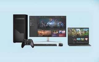
The verdict: It works, but it doesn't look good.
How to download the Xbox (Beta) app
Downloading the new Xbox app can be a pain if you're not already a Windows Insider. If you don't know what that means, don't worry; our short guide on how to become a Windows Insider will make your life simpler. After you're all set up, which might take about an hour, you can head over to Microsoft's website to download the Xbox app.
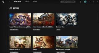
The layout for the Game Pass tab in the app is filled with randomly spaced stubs for games that come in several shapes and sizes, making the interface look sloppy rather than neat. The stubs take up a lot of real estate, so they just look like entries for blog posts, instead of, you know, games displayed for purchase or download.
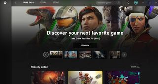
When I took a tour down the All Games section in the Game Pass tab, I immediately noticed that the games weren't listed in alphabetical order. Nor was there a way to change the order, which made it all look like a randomly selected nightmare.
Stay in the know with Laptop Mag
Get our in-depth reviews, helpful tips, great deals, and the biggest news stories delivered to your inbox.
The search function isn't very intuitive, either. Ideally, it would have an auto-fill feature, but it doesn't, and it's not good at handling incomplete words. I typed in "gear," and the only search results were Everspace, Ark: Survival Evolved, ReCore and Rise of the Tomb Raider. Those weren't anywhere close to my intended target: Gears of War. Only by typing in "gears" did I get what I was looking for.
So you have to have at least one correctly spelled word to find what you're seeking. I may sound nitpicky, but this requirement makes the user's experience much more frustrating, when it doesn't have to be. However, you can browse by genre, which is neat.
Overall, you'll be able to find what you're looking for eventually, but you'll feel like you had to dive into a third-party app to do it.
Social
The entire tab for social looks out of place, and its features are so scant that it would have worked better as a sidebar. (Side note: The friend search function can auto-fill, so why can't the Game Pass tab do the same?) My biggest gripe with the social tab is that player profiles and achievements are not built in, so when I went to click on a friend's profile, the app directed me to Google Chrome.
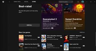
The app doesn't feature Xbox Avatars, either, and while I understand that Avatars has its own app, it really should be consolidated into Xbox's. The Xbox app also lacks a section for Clubs or the Looking for Group feature, which is arguably one of the most important updates Xbox Live ever got.
Store
The layout for the Store tab is more or less the same as that for the Game Pass tab. It even suffers from the same search and ordering flaws. However, it didn't even bother to bring over the option to search by genre.
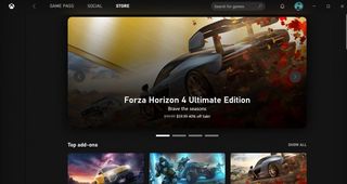
Technically, all the games are on Game Pass, anyway, so you can go through the Game Pass tab to search by genre. However, what happens when games come to the Xbox for PC app but aren't available on Game Pass?
On top of that, it was incredibly odd that there wasn't a section for new releases. And since the app exclusively features Xbox Game Pass titles (for now), there's no section for free-to-play games or even demos.
Gaming
Once you download a game, it'll show up on the left side of the app, right under the Xbox logo, which is the only part of the app that looks neat. The games will also have shortcuts in your Windows search bar, so you don't have to open the Xbox app to get to your game.
If the Xbox app is open while you go into a game, it'll stop running in the background, so it doesn't interrupt you. If you want to access your friends list or other Xbox features while in game, you can press Windows + G to pull up the Xbox Game Bar.
Outlook
It's as if the Xbox app for Windows asked its console counterpart if it could copy its homework, and the Xbox One said, "Yeah, just change it a bit so it doesn't look obvious you copied." It's a classic meme, but it's not what the people want.
Sure, not a lot of people are fans of the Xbox One OS on the console, because it's a little jampacked with icons, but at least it looks organized and neat. The Xbox app for Windows is just sloppy.
We had a solid template on the Xbox One; there's no reason to change it up. Hopefully, we'll see some of the great Xbox One features translate over to the Xbox app for PC when it leaves beta sometime in the fall.
Credit: Microsoft

Rami Tabari is an Editor for Laptop Mag. He reviews every shape and form of a laptop as well as all sorts of cool tech. You can find him sitting at his desk surrounded by a hoarder's dream of laptops, and when he navigates his way out to civilization, you can catch him watching really bad anime or playing some kind of painfully difficult game. He’s the best at every game and he just doesn’t lose. That’s why you’ll occasionally catch his byline attached to the latest Souls-like challenge.