Android 13 hands-on impressions
Android’s thirteenth major update is here. Here’s what it is like to use Android 13
Google accomplished what it set out to do with Android 12. With a fun, personalized new theme engine and a major facelift, Google restored Android’s soul in 2021 and successfully made it a joy to use again after years of practical, mature updates. So it’s no surprise Google is keeping things quiet this year with the latest Android 13, which tightens the loose ends Android 12 left behind, adds several features, and leaves whatever worked well untouched.
The new Android 13 release, available for a handful of Android phones, including Google’s own Pixel line in public beta, marks the second chapter of the OS’s Material You refresh, and instead of focusing on grand, ambitious overhauls like its predecessors, it addresses a few long-standing Android concerns. Android’s growing list of privacy tools, for instance, will soon no longer be scattered all around the Settings app and are now easier to find and understand under a revamped, unified screen.
I’ve been testing Android 13’s public beta for a couple of weeks on a Google Pixel 6. Here’s what I think of it so far.
When you first boot into Android 13, it’s rather hard to tell if you’re on a new update. There’s little to differentiate it from Android 12 at the outset. It’s when you begin to get into your usual groove you notice the subtle changes that define Android 13.
More ways to personalize
On Android 13, after Material You is done extracting colors from your wallpaper to personalize the rest of the software, it offers you up to four times more color combinations to pick from to create your own palette (16 vs. 4). The themes also now style non-Google app icons on the homescreen. Speaking of style, the media player notification on Android 13 shows the album art as background and swaps the plain, old seekbar for a squiggly animation.
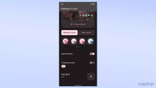
However, you’ll unlikely see the new icon theming in action since its availability depends on third-party devs, and none of the apps I have on my phone support it yet. So at the moment, it looks a bit out of place with only a few Google icons matching the theme and defeats its purpose, which is to enable a consistent look across your phone.
Privacy settings that make sense
Another addition that I’m excited about and is yet to arrive on Android 13 is the unified privacy and settings page. Over the last few updates, Google has rolled out tools to protect your identity and data at a breakneck pace to catch up to iOS, and at its annual developer conference I/O this year, it said it’s finally collating all of them in a single, approachable dashboard-like screen.
Stay in the know with Laptop Mag
Get our in-depth reviews, helpful tips, great deals, and the biggest news stories delivered to your inbox.
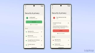
The new “Security & Privacy” menu will let you access all the ways to secure your information and your phone in one place. More importantly, it will tell you how up-to-date your settings are, whether there’s any vulnerable spot you should look into, and what sort of action you can take. For example, the unified page will display a red “Your device is at risk” warning if you have any suspicious app installed on your phone. This could very well end up as Android 13’s top highlight and put Google’s mobile OS on par with iOS -- even above it to an extent since Apple doesn’t offer any such one-stop-shop solution for privacy and security.
New iOS-esque data permissions
Arguably my favorite aspect of Android 13 so far are the more granular data permissions. Similar to iOS, Android will now make apps ask for your approval before bombarding your phone with alerts. Plus, you no longer have to allow an app to read all your media files if you’re just looking to share a couple of photos with it. A new iOS-esque photo picker enables you to send your selected pictures and videos to an app without giving it no-questions-asked access to your phone’s entire media library.
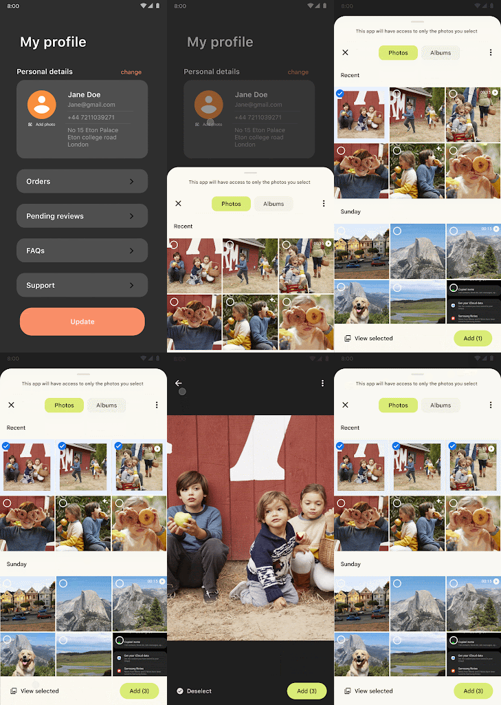
I’m glad Google’s addressing these long-overdue concerns with Android 13, and the notification permission especially has been a godsend in the couple of weeks I’ve been using the update. Unfortunately, like a few other features, the granular media permissions are not yet enforced, which means you’ll unlikely see them in the wild until third-party devs update their apps to support it. Hopefully, that will change once Android 13 exits beta.
It’s the little things
Android 13 comes equipped with plenty of more little handy additions you won’t immediately discover. When you copy any text, for instance, it’ll minimize into a small floating window on the corner like screenshots. You can tap it to edit your text before pasting it somewhere else. Android now also automatically wipes your clipboard history after a short while to prevent apps from snooping on your old clips. Further, the update brings an ability that I would have appreciated at the beginning of the pandemic: a QR code quick setting tile.
In addition, you don’t have to go through a maze of menus to control your smart home on Android 13. There’s now a button right on the lockscreen you can touch to instantly interact with your connected appliances. It’s also more proactive at informing you of apps consuming too much battery or CPU power in the background.
What’s more, Android 13 might just save us all from back gesture hell. Ever since Google switched to full-screen navigation gestures from on-screen buttons, it has failed to figure out the back action since it overlaps with a handful of other fundamental elements like side menus and swipes. On many occasions, I often don’t know whether swiping inwards from the left and right will take me back to the previous screen or, say, archive an email on Gmail. Starting from Android 13, it will let developers opt in to a new “predictive back gesture,” which will allow users to peek at the action before executing it so that they can redo it in case it’s not doing what they intended.
If done well, the predictive back gesture could fix what has ailed Android for years. But again, this is subject to developer and manufacturer participation.
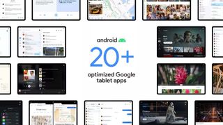
Android 13 is a significant stepping stone for Google’s renewed focus on tablets as well. Not only will it make it easier for developers to build multi-column layouts for big screens, but it also revamps multitasking to match iPadOS. Android 13 will feature an always-available dock you can pull up to instantly pick apps and jump into split-screen.
Chromebook users aren’t left out either. Google is extending its suite of continuity abilities, and soon, you’ll be able to stream apps from your Android phone to access, for instance, your text messages on your Chromebook. These are expected to arrive by the time Google releases Android 13 publicly.
Android 13 may seem like it barely qualifies as an Android 12S update, but under the hood, there are enough meaningful changes that may not instantly affect your day-to-day experience but can have a huge impact over time. The back gesture won’t be frustrating anymore, the proactive alerts will allow you to kill apps before they drain your phone’s battery, tuning your privacy settings won’t feel like a chore thanks to the unified settings, the Play Store will hopefully see a surge in tablet apps, the list goes on. And even on its early builds, I’ve yet to face any bugs other than the occasional crashes.
If you’ve got a compatible phone, you can try the Android 13 beta right away or wait for the public release, which is expected to land later this year. We’ll continue to put the update through its paces during its beta period and tell you all about it in our in-depth review soon.
Shubham Agarwal is a freelance technology journalist from Ahmedabad, India. His work has previously appeared in Business Insider, Fast Company, HuffPost, and more. You can reach out to him on Twitter.
