macOS Monterey preview: Apple’s soft update lacks meaningful additions
MacOS Monterey marks another year of Apple improving its in-house services and overlooking its desktop OS's biggest flaws
I switched to the Mac nearly half a decade ago. Like every other OS, macOS had its fair share of flaws, which I hoped Apple would take care of over time. Five years later and with macOS’s 18th major update -- Monterey -- looming around the corner, Apple’s desktop OS has shown little signs of any functional progress.
Apple’s latest update for Mac computers, macOS Monterey, has been out in beta for a few weeks. Yet, despite installing it on day one, it hasn't had any real impact on my daily workflow, and there’s a good reason why. Apple has a new goal with its recent updates: ramping up in-house apps to keep people from flocking to alternatives. Monterey’s headlining features, therefore, are exclusive to those who subscribe to Apple’s services or own other Apple products like an iPad.
Apple apps take precedent
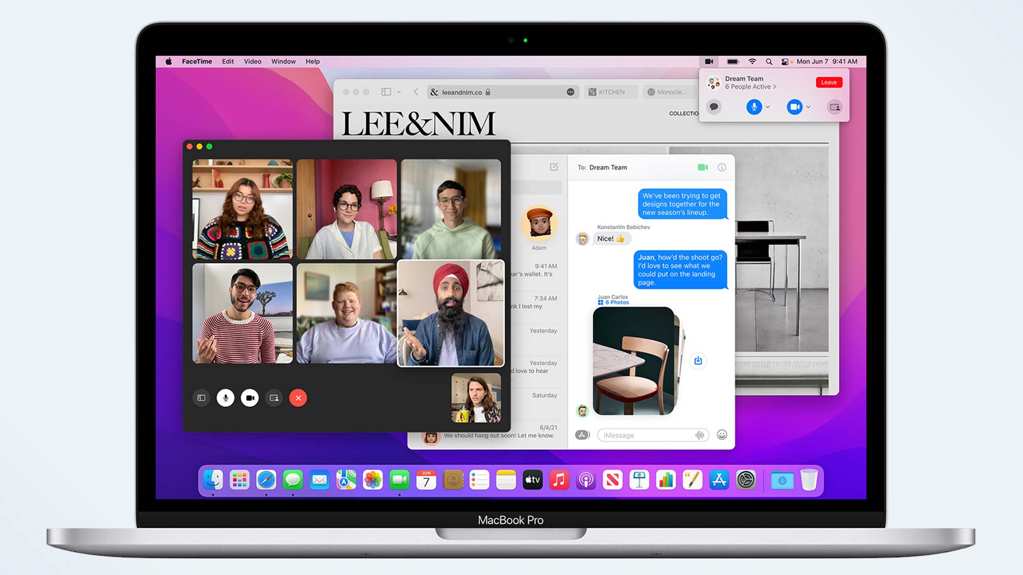
FaceTime dominates Monterey’s list of updates, and Apple added a range of new tools to it so that its video-calling service is better equipped against competitors like Zoom. Users can now share their screen or watch movies and TV shows together on apps like Apple TV+ while on a FaceTime call with someone. There are several more new handy features for a better call experience, including voice isolation, which automatically mutes noises apart from your voice, and a portrait mode that blurs your background.
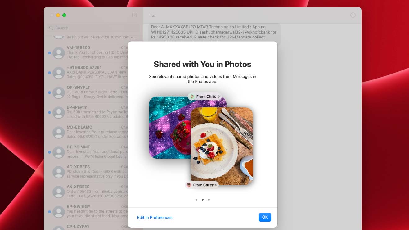
Similarly, iMessage has gained a slate of social components that sync any content from Apple platforms shared with you in dedicated new sections. If someone sends you an Apple Music playlist on iMessage, for instance, it’ll show up in a “Shared With You” tab on the music streaming app.
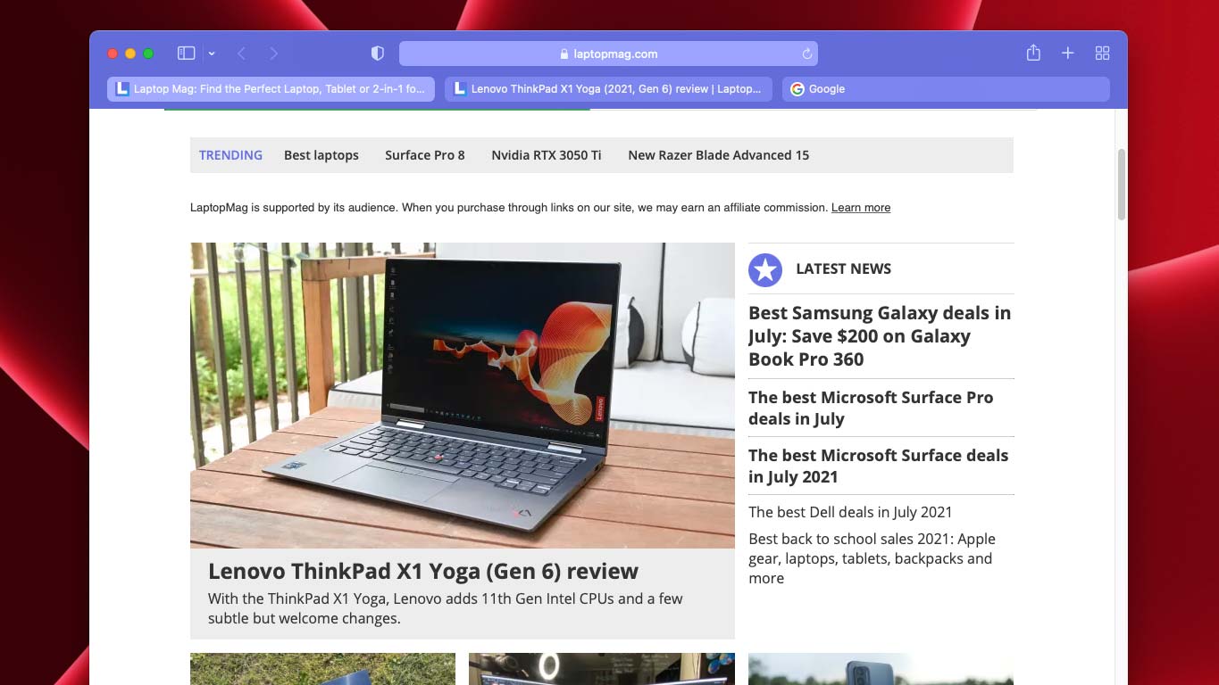
Another rather controversial highlight of macOS Monterey is the redesigned Safari browser. Its tab bar now adapts to match the colors of the site you’re visiting, and on the new Safari, you can organize your tabs in groups.
Halfbaked features
However, Safari’s latest updates haven’t quite received the reception Apple was expecting as the new look prioritizes form over function. The removal of the URL bar and the lighter hues made it difficult for users to navigate, and Apple, in the third beta, had to undo most of these changes. Therefore, it’s still very much a work in progress, and it remains to be seen what Safari will look like in Monterey’s public release.
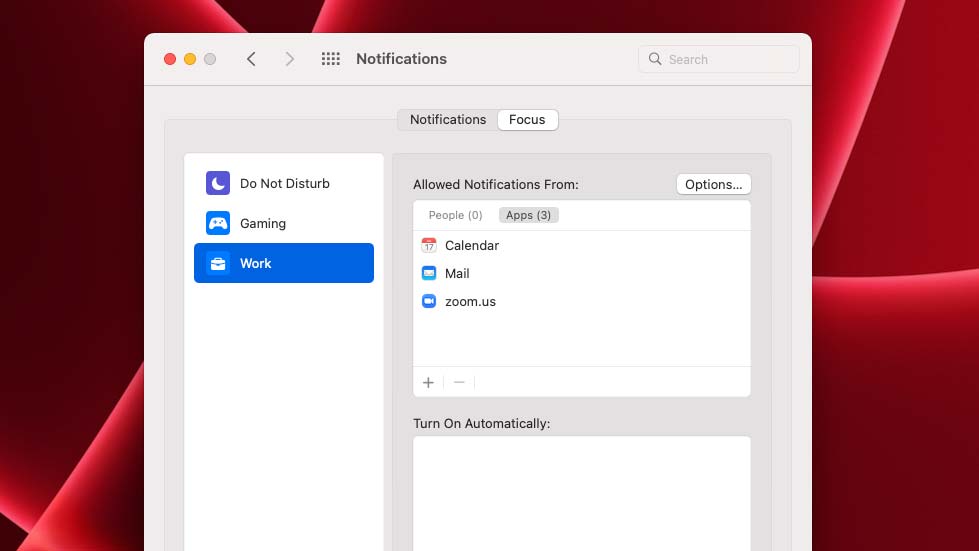
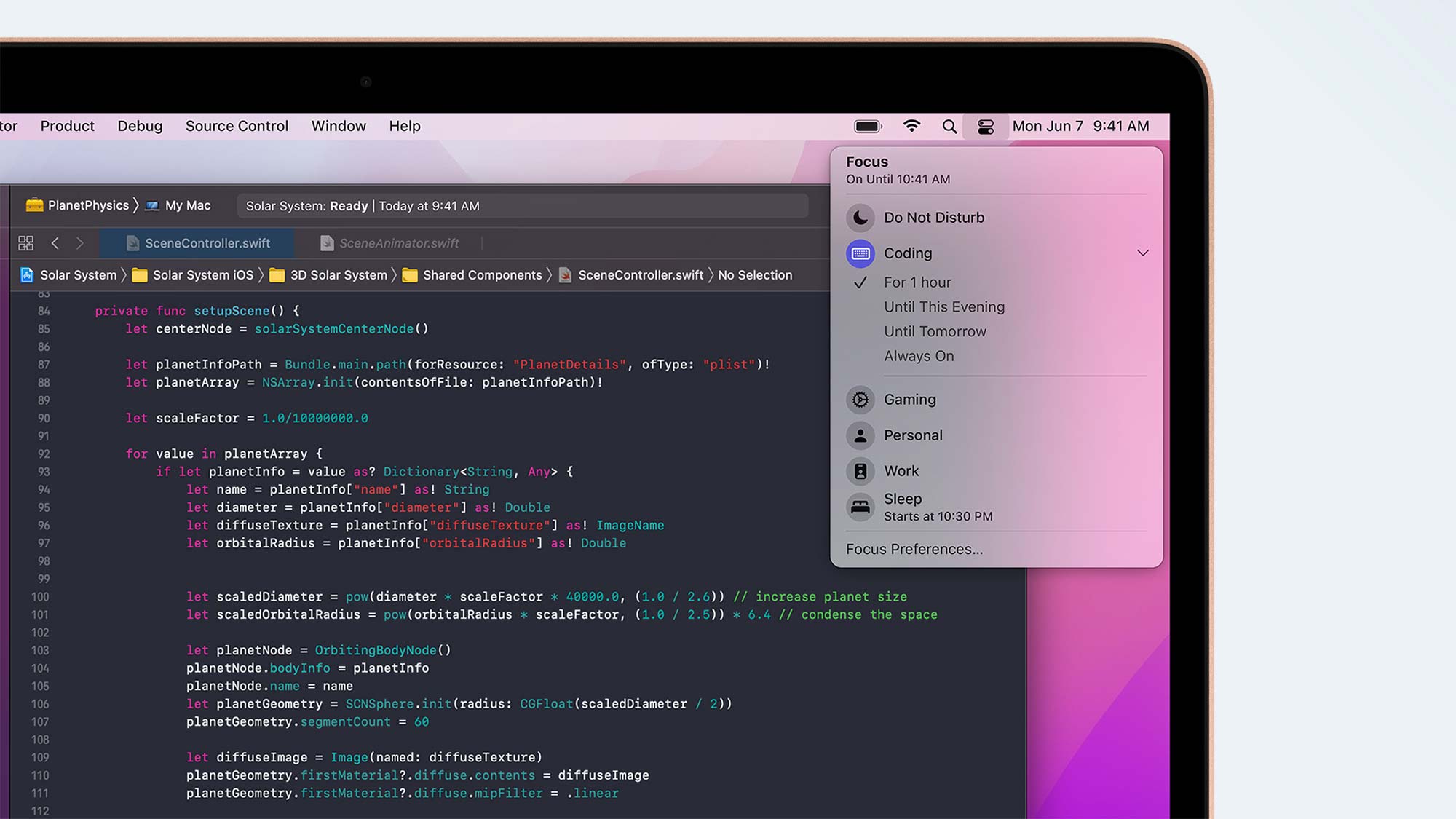
Further, the Monterey update brings “Focus” profiles to the Mac. These function similar to the Do Not Disturb mode -- except you can create multiple of them to filter interruptions and app notifications based on what you’re doing at the moment. For example, you can have one for work where only alerts from Slack and Email can show up.
Stay in the know with Laptop Mag
Get our in-depth reviews, helpful tips, great deals, and the biggest news stories delivered to your inbox.
The macOS Monterey update has a giant pool of other features, but if you don’t subscribe to Apple services, you probably won't find a use for them. A new privacy tool called iCloud Private Relay encrypts your network traffic, but it requires you to pay at least a dollar a month for the iCloud+ subscription. Universal Control makes it easier to drag and drop across your Mac and iPad and use a single mouse or keyboard to control them.
I’ve been a Mac user for a couple of years now, and none of the updates Apple has released since has helped my workflow in any meaningful way. And that story continues with Monterey, as most of its features could simply have been individual app updates.
Old problems remain
Apple’s recent updates have surprisingly few practical additions that can make a difference on your desktop experience and, in focusing on improving its services or their products’ continuity capabilities, the iPhone maker has overlooked its desktop OS’s real drawbacks. Even on last year’s Big Sur rollout, the flagship feature was an iOS-like interface even though Apple has no plans for launching a touchscreen-equipped computer.
I still have to turn to a third-party multitasking app like Magnet to manage my open apps and get around macOS’ poor built-in window management. And I have to install a utility app to have a tiny calendar on the menu bar. Another app is needed for a clipboard manager, to personalize the menu bar, and the list goes on. Apple updates, unfortunately, have done little to fundamentally improve the most important aspects of a computer experience, like multitasking and personalization.
Windows is gaining ground
MacOS’s laggard growth appears especially problematic when we look at the updates Microsoft has been rolling out for Windows lately. Since Windows 10, the software giant has been laser-focused on patching all that has ailed its desktop OS for years.
That’s even more apparent with the latest Windows 11. Its new look is designed to put an end to Windows’ overwhelming interface. It transforms Windows into a more approachable and simpler modern platform without compromising on any legacy functions. In addition, Windows 11 tackles the operating system’s long-standing pain points, such as its messy installation process with a revamped Microsoft Store.
Over the years, Microsoft has also steadily added a series of clever and practical features to Windows, including an unparalleled window multitasking system, a clipboard manager, a phone companion service, Windows Hello, and more.
Windows has nearly closed the gap that pushed many, including me, to macOS, while Apple has struggled to catch up to Microsoft’s utilitarian updates. If compatibility snags don’t deter the Windows 11 rollout, there’s a chance macOS will find it difficult to hold on to its market share, and soft releases like Monterey won’t save it.
Shubham Agarwal is a freelance technology journalist from Ahmedabad, India. His work has previously appeared in Business Insider, Fast Company, HuffPost, and more. You can reach out to him on Twitter.
