8 new features in iOS 14 you’re really going to love
It’s safe to say that this might be its best update so far
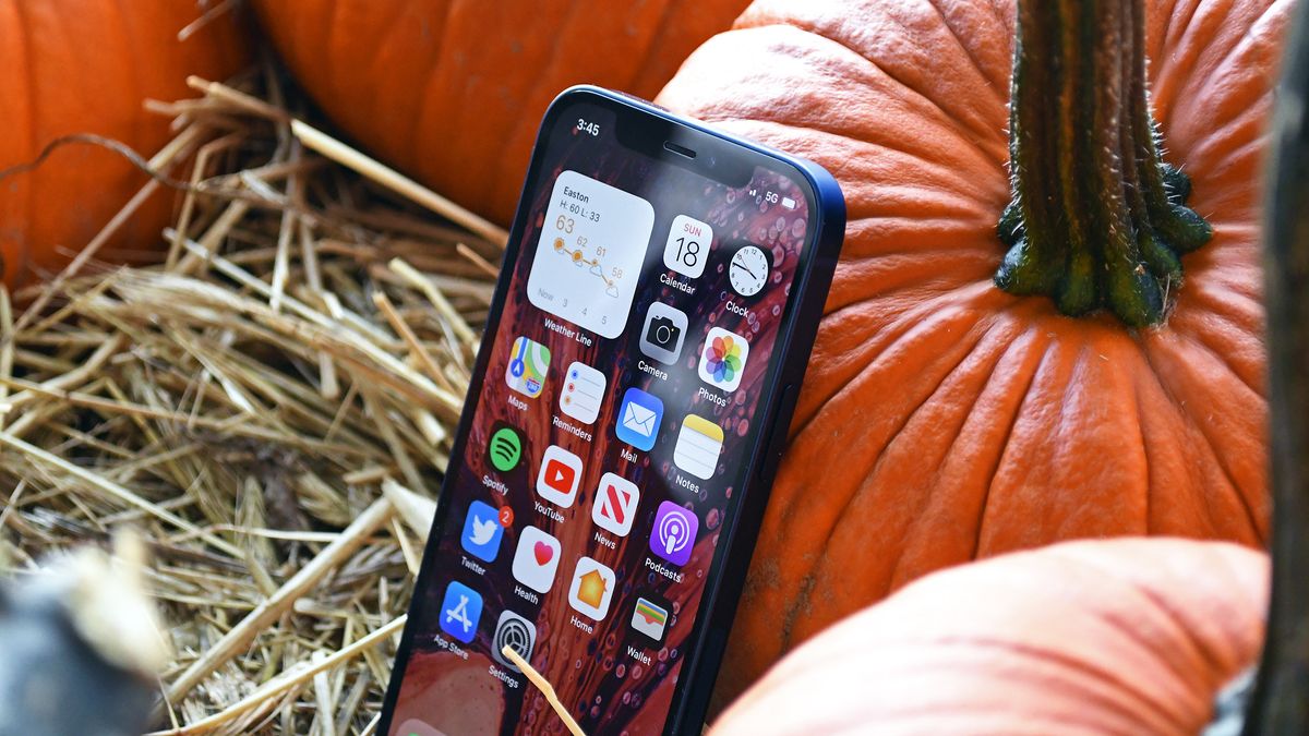
Apple first announced iOS 14 a WWDC, its first virtual developer conference, earlier this summer. After more than a month of using the developer beta, and then the public beta, it’s safe to say that this might be its best update so far.
For the first time in its history, iOS just feels different. That’s not to say Apple ditched your familiar favorites, but there are a lot of new features you’re really going to love.
You can grab the public version this fall, but in the meantime, here’s what you have to look forward to.
Widgets
This is going to be a recurring theme here, so bear with me. Apple, for the first time, is offering customizable widgets, and not just in the Today view; you can add first-party (Apple product) widgets to any of your home screens too. Better still, each of these apps has a few customization options, specifically in terms of size and viewing options.
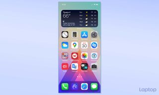
It’s not quite as customizable as Android, but it’s a good start, and I’ve had a bit of fun customizing my home screen with the available widgets.
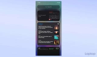
I only wish Apple allowed you to move third-party widgets to the home screen. For now, at least, you can only use them in the Today view.
App Library
Remember that warning that this might turn into a recurring theme? Here’s another of those features I was talking about: App Library. Essentially, it’s what Android owners have had for, well, ever. And while Apple does it well — it automatically sorts your apps into folders and offers both an alphabetical scrolling option, and a search bar — it’s not exactly revolutionary. But you’re still going to love it.
Stay in the know with Laptop Mag
Get our in-depth reviews, helpful tips, great deals, and the biggest news stories delivered to your inbox.
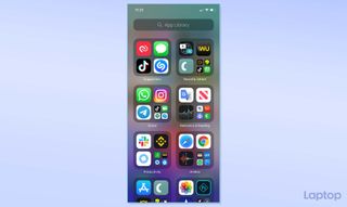
And though the App library is the standout feature here, what I found much more impressive is the ability to hide entire home screens. After work, for example, you could hide all of the apps from a designated home screen for work-related apps.
Of course, you can customize this to your heart’s content. Just note that a hidden screen doesn’t mean the app is hidden. They’ll still appear in your App Library.
Better Window Management
We’re going to combine a few features here and talk about how much easier it is to multitask in iOS 14 because of how it handles apps that normally took over the home screen.
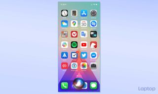
Siri, for example, is now just a bubble at the bottom of the screen rather than an invasive app that hijacks your home screen.
Also, with some inspiration from the iPad, iOS now has a picture-in-picture mode that allows you to watch a video (or take a FaceTime call) even after swiping away. When you’re watching a video, for example, and you swipe to the home screen to check your text messages, your video continues to play in a little box. You can move this box around, resize it, or swipe it away when you’re done.
App Clips also fall into this category. In essence, it’s a mini version of the full application that allows you to use on-demand pieces of it without having to download and install the full version. These also appear in a picture-in-picture window without hijacking the entire screen.
Messages
Anyone that gets a lot of two-factor authentication codes, or random spam texts should appreciate a new feature in Messages that allows you to pin up to nine conversations. Once pinned, these conversations stay at the top of your screen, regardless of whether newer messages (from non-pinned chats) are newer.
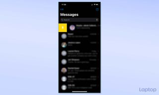
Group chats are much improved too. Now you’ll see images of everyone in the group, and you can (finally) reply to a specific person using in-line message replies, or tag them in a thread to address them directly.
Change Your Default Browser or Email Client
This is another feature that belongs in the “finally” category, but it’s finally here. IOS users can now choose their default email apps and web browsers. For years, clicking an email address, or a hyperlink meant opening Mail, or Safari. Now, you can open these links using Spark, Hey, Airmail, or any other email client (or web browser) of your choice.
Privacy Upgrades
My favorite new privacy feature is a simple dot in the upper right corner of the screen. This dot, when green, shows that an app is using the camera. When orange, it means an app is using the microphone. This is insanely useful for figuring out what’s watching, or listening, even when they shouldn’t be.
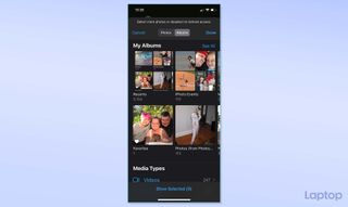
You’ll also get more granular control over what you’re sharing with applications when they ask for it. Apps that want to view your photo library, for example, can be limited to viewing select folders instead of the entire thing.
Another cool feature is the ability to give apps your approximate location instead of your exact location.
Translate
Google Translate works fine, so I’m not sure this is much of a game-changer. But from a few weeks of using it in Mexico, I can tell you that it does seem much more responsive than Google Translate, and the translations are on point too.
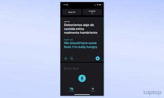
Unlike Google Translate, you just select two languages (speaking and translating) and start talking. Apple figures out which language you’re speaking, and what language to translate it to. This is handy, as it saves you a button press. In Google, you’ll need to tell it which language you’re speaking, and which language you want to translate to — and then switch it back and forth during conversations.
Unified Search Refinements
On the iPhone, Apple combined search into one, singular search bar. Now, a search here brings up Siri suggestions and apps, as well as results from your contacts, mail, maps, messages, files, and suggests web searches.
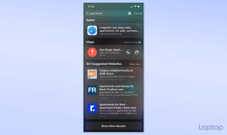
It’s Spotlight, essentially, in iOS 14. And it certainly makes life just a little easier, especially for app hoarders like me.
