Android Ice Cream Sandwich: What’s Cool, What’s Melted
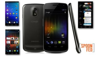
Is Ice Cream Sandwich truly a leap forward or a very sleek Android skin made by Google itself? That’s the question I asked myself as I tested the Samsung Galaxy Nexus, the first smartphone to run Android 4.0. There’s no question that Google’s software is a lot more attractive and easier to use than before—and it does a nice job of borrowing some of the best elements of Honeycomb tablets, such as interactive widgets. But is the beauty more than skin deep? Here’s what I like about Ice Cream Sandwich, and what feels melted.
What’s Cool
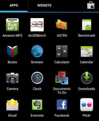
Geek Meets Chic: Over the years I’ve poked fun at Android for having the aesthetic appeal of a graphical calculator. Not anymore. I love the way the icons zoom into view when you use Ice Cream Sandwich’s new App menu. And the new Roboto typeface makes text look tighter and cleaner, making the Apps Menu feel less cluttered. There’s a lot more open space. As with iOS, you can drag and drop icons on top of one another to instantly make folders—only on the five homescreens—but you have to name them yourself.
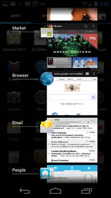
Superior Multitasking: Perhaps my favorite feature in Ice Cream Sandwich is the Recent Apps button, which was borrowed from Google’s Honeycomb tablet OS. Just press the button and all of the apps you’ve used recently will fan out in a stack. It’s the most efficient way to multitask I’ve seen yet. Even better, you can close apps with a simple swipe. Windows Phone doesn’t let you do that, and iOS requires a few taps. You can also use this handy swipe-to-dimiss gesture in the Notification area.
Fun with Photos: Android 4.0 comes with a ton of photo editing tools, obviating the need for a third-party app. You can crop pics, flip them, auto-fix them, and make all sorts of other adjustments (like warmth and saturation). Plus, you can add all sorts of Instagram-style effects. Just like iCloud, Ice Cream Sandwich’s Instant Upload feature lets you store your images in the cloud, but you need to be signed up for Google+.

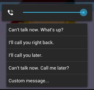
Respond to Calls with Texts: You’re in a meeting and a call comes in. Instead of just ignoring it, Android 4.0 lets you swipe up and choose from multiple canned responses, like “I’ll call you right back.” If you have a little more time, you can create your own custom message. Of course, this feature only works if the person calling you isn’t using a landline.
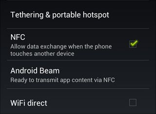
Sharing with Android Beam: I don’t care if people call Android Beam gimmicky. I like the idea of sharing info via NFC with other Android phone owners with a tap, and I can’t wait to try it with another Galaxy Nexus. Google says Beam will work with contacts, music, videos, and apps (a link to the right place in the Android Market), but I’m more excited to see what developers and Google do with this technology. Like exchanging LinkedIn Profiles instead of business cards and beaming money into someone else’s Google Wallet account.
Stay in the know with Laptop Mag
Get our in-depth reviews, helpful tips, great deals, and the biggest news stories delivered to your inbox.
What’s Melted
People App Needs Facebook Love: Ripping a page from Windows Phone’s playbook, Android 4.0 features a People app that offers large profile pictures along with the most recent status updates of your friends on Google+ and Twitter. Did you notice that I left off Facebook? Yup, that service isn’t integrated into Ice Cream Sandwich, and there’s no timetable for its arrival. You’re reminded of the lack of Facebook integration every time someone calls you in your address book that isn’t on Google+ or Twitter and you see a big blank avatar of a person.
Merging Contacts is a Pain: While we’re on the subject of contacts, I was shocked to find out how difficult it is on Android 4.0 to merge contact information for people who appear multiple times in your address book with the same name. On Android phones with HTC Sense, it’s as simple as looking in your notifications panel, tapping a link icon, and then hitting OK. The phone basically walks you through it. On our Galaxy Nexus, we needed to click on a contact, then the Menu button, then Edit, then the Menu button again, then Join. Then you select the duplicate contact and repeat the process for however many times that same person shows up. Yikes.
Bring the Search Button Back: Yes, there’s a search box on each of Ice Cream Sandwich’s homescreens, and you’ll find a search option in apps like email in a new Action Bar, but we miss having a dedicated search button in the bottom right had corner of the screen no matter where we are within the OS. In addition, you can only activate Google Voice actions now from the home screens.
Face Unlock Hit or Miss: It sounds cool and convenient on paper. Just stare at your phone to unlock it. But the Face Unlock feature in Android 4.0 worked maybe 70 percent of the time in our tests. Whenever we didn’t have enough ambient light, the phone’s front-facing camera couldn’t recognize us. Also keep in mind that you can’t swipe left to launch the camera when with Face Unlock, as you can when you’re just using a finger.

Voice Input Falls Flat: Android 4.0 is supposed to let you dictate continuously in text fields just by pressing the microphone icon. Unfortunately, the software didn’t capture all of our words, and you need to say punctuation marks for them to be registered. When we didn’t have a good data connection, the voice input didn’t work at all.
Bottom Line
If you’ve previously owned an Android phone or were interested in buying one, Ice Cream Sandwich will feel like a whole new wardrobe. It’s tighter, more modern, and easier to use than anything Google has produced before. I also give the completely revamped Photo and People apps props, even if the latter is unfinished.
However, other than vastly improved multitasking and perhaps interactive widgets, there’s no one feature that I would point to that would necessarily make an iPhone owner want to jump ship. Windows Phone does a better job with integrating social networking and has even less of a learning curve than Android 4.0. Android is still the OS of choice for people who crave power and flexibility. It’s just a smarter and better looking package.
Editor-in-chief Mark Spoonauer directs LAPTOP’s online and print editorial content and has been covering mobile and wireless technology for over a decade. Each week Mark’s SpoonFed column provides his insights and analysis of the biggest mobile trends and news. You can also follow him on Twitter.
