Laptops still have this annoying power button problem — it needs to stop
Please, fix this trivial, yet annoying problem

Apple fixed the MacBook keyboard, Dell made a laptop without bezels (XPS 13) and there's this folding thing from Lenovo — the world of laptops is a beautiful place right now. And yet, through all the innovations and iterations, certain companies still haven't figured out where to place the power button.
The good folks at CNET covered this problem in 2015. Now it's 2020, and I'm here under lockdown in quarantined America venting my anger about the most trivial of quibbles -- but one I can no longer ignore.
- Best laptops 2020
- Apple keyboard face-off: Are the MacBook Pro's 'scissor' keys really better?
- Laptop buying guide: 8 essential tips to know before you buy
I have the Asus ExpertBook B9450 to blame. Before I rag on it, I'll give the laptop its due credit; It has a featherweight chassis, an attractive indigo-blue design and record-breaking battery life (16+ hours). So why did it "only" get a four-star rating? In part because I inadvertently made the laptop go to sleep four times while writing my review of it.
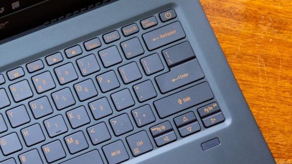
The problem? The placement of the power button. Positioned next to the delete key, the power button is begging to be pressed by error-prone writers attempting to backtrack on a typo.

The placement wouldn't be so bad if the power button didn't look exactly like the delete key but cue the sad trombone sound because it has the same size and shape. Worse yet, a single tap (with default power settings enabled) makes the laptop go to sleep. Hunt-and-peck typists might catch themselves in the act, but touch typists like myself aren't so lucky.
MacBook owners (Macs don't have forward-delete keys) and backspace-only Windows 10 users might not know the purpose of the delete key, but anyone who relies on that small rectangle in the upper-right corner of the keyboard to kill extra spaces or swallow an unneeded word from front to back can sympathize with my struggle.
It turns out someone at Asus is one of those people. An Asus rep emailed me after my review published jokingly explaining that she encountered the same problem. YouTube commenters were also happy to hear from someone echoing their frustration, and I felt good about not being the only one picky enough to complain about it.
Stay in the know with Laptop Mag
Get our in-depth reviews, helpful tips, great deals, and the biggest news stories delivered to your inbox.
It's a recurring problem
Asus isn't the only company at fault. Its Taiwanese rival, Acer, made the same flub with the Swift 5. Again, this is a case of a great laptop marred by the most basic complication.
Dell did something similar with the new XPS 13 by moving the power button from the deck to the keyboard. However, in this case, they accounted for accidental taps by making the power key, which doubles as a fingerprint sensor, more recessed than those around it.
What's the solution?
If you're one more accidental keypress away from flinging your laptop out the window, or are considering buying a notebook with this unfortunate layout, you're not entirely out of options.
One solution is to change the power settings in Windows. The downside to this method is that nothing will happen when you actually need to use the power button. Instead, you'll need to turn off your system using the on-screen option.
You wouldn't need to do this if the root of the problem were fixed. The simple answer is to stop making the power button and the delete key neighbors. If you have to, do as Microsoft did with its Surface laptops and put the delete key in the upper-right corner and the power button to the left. This way, you can still instinctively tap "delete" by reaching for the upper-right most key.
If a vendor wants to keep the same key placement, at least make the power button more difficult to press by either increasing the actuation force or making it more recessed.

Lenovo's solution was to move the power button to the side, as we saw on the ThinkPad X1 Carbon. While this lets you turn the laptop on/off when it's docked, it can be difficult to find the power button by feel.
A better solution is to place a dedicated button on the deck of the laptop, away from the keyboard -- where it is on most laptops. Unfortunately, the often-misguided desire to make laptops slimmer has complicated things.
We shouldn't be having this conversation in 2020, but if this glorified rant puts an end to this anger-inducing annoyance, then I'm happy to do it.
Phillip Tracy is the assistant managing editor at Laptop Mag where he reviews laptops, phones and other gadgets while covering the latest industry news. After graduating with a journalism degree from the University of Texas at Austin, Phillip became a tech reporter at the Daily Dot. There, he wrote reviews for a range of gadgets and covered everything from social media trends to cybersecurity. Prior to that, he wrote for RCR Wireless News covering 5G and IoT. When he's not tinkering with devices, you can find Phillip playing video games, reading, traveling or watching soccer.
