Laptop Mag Verdict
Pokki is a slickly designed Start menu option for Windows 8 users that offers a robust notification system, but the app pushes its own app store too hard.
Pros
- +
Start menu redesign simplifies layout
- +
Offers 16 one-click favorite app launchers
- +
Mobile style notifications display for emails, Tweets, and apps
Cons
- -
Unwanted and arbitrarily selected app icons mar otherwise clean layout
- -
Link to store goes to Pokki's instead of Windows 8's
Why you can trust Laptop Mag
Pokki's approach to a Start menu is a little bit of country and a little bit of rock 'n' roll. It bows to the legion of existing Windows XP to 7 desktop users while offering live notifications for email, Tweets and apps, mirroring the mobile and tablet experience for which Windows 8 was designed.
Setup
Installation was quick for Pokki's 784KB file, but be sure to check the option box to "use Pokki as your start menu" that might otherwise be overlooked. If you miss it, Pokki offers pokey performance.
Interface

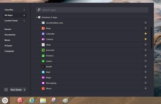
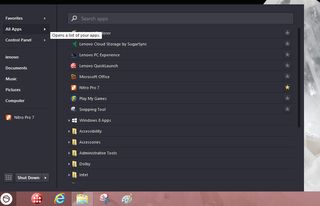
Click to EnlargeThe look and feel of Windows 7 is missing in Pokki, replaced with a newly interpreted design that still is an improvement over Windows 8's Start Screen. The simplified, almost skeletal, look of this utility includes basic links to documents, computer, music, pictures and the Control Panel. An All Apps submenu reveals native Windows 8 apps as well as others you've added. All of the above options are accessible via either a pointing device or touch (on supported systems).

Click to EnlargeUnique to this Start menu is a Favorites group to which you can pin or unpin up to 16 native or other apps, which appear as thumbnail icons on the menu. Each submenu app listing has a star adjacent to it. Touch or click that star and the app will appear in one of the 16 available slots.
There are a couple of drawbacks here. Dragging and dropping icons to the Pokki Start is not enabled, and right-clicking an icon to select Pin to Start sends it to the Windows 8 Start menu, not Pokki's.
Performance

Click to EnlargeNearly a third of Pokki's menu real estate is comprised of a Notifications area, which offers alerts for incoming emails, tweets and more, but only for apps downloaded from the Pokki store. (Apps from the Windows store only show up on the Start Screen). The downside to this layout are four preset icons for suggested downloadable apps at the bottom of the Pokki Start menu. While not necessarily crapware, they add unwanted clutter to an otherwise clean look.
Pokki's search bar works just as efficiently as Windows 7's but is unconventionally located at the top of the window. At the bottom of the window is a link to the Pokki app store, not the expected Windows Store. To be sure, the majority of apps in Pokki's store are popular ones, such as "Angry Birds," Facebook, Twitter and Kindle.
Features
A boon to users of previous versions of Windows is a boot-to-desktop option in Pokki's settings. Click on that and the next time you boot Windows 8 it will default to the desktop view, not the Modern-style Start display. Actually, Pokki works with all versions of Windows back to XP.
Verdict
Overall, we like Pokki for its favorites feature and notifications, but it pushes its own app store a little too hard. Among free options, we prefer the more customizable Classic Shell. Those willing to shell out more will appreciate the more intuitive and feature-rich Start8. Still, Pokki is definitely worth a spin.
Pokki Specs
| Company Website | http://www.pokki.com |
| Platforms | Windows |
