Laptop Mag Verdict
While a refreshed aesthetic might be the first thing you notice, this isn’t merely a design update. Updates are everywhere and you’ll almost certainly be finding new and improved features and additions for months once you try it out.
Pros
- +
Beautiful redesign
- +
Safari is better than ever
- +
Useful additions to Messages
- +
Apple Maps is closing in on Google
Cons
- -
Mobile elements lack touchscreen support
Why you can trust Laptop Mag
November has been a big month for consumer laptops. The conversation, to date, has centered on two releases from Apple: its M1 chip and macOS Big Sur.
First up was Apple’s M1 chip, announced during a pre-recorded event this month. The chip is Apple’s first in-house processor release after it confirmed its split with Intel earlier this year. The chip has been worth every bit of the wait. Our testing of the new MacBook Air and MacBook Pro shows significant improvements in speed and battery life.
And as impressive as the M1 seems, it’s no reason to overlook the release of Apple’s second major announcement: macOS Big Sur. Big Sur is Apple’s latest desktop operating system, the first release of macOS 11, after nearly 20 years of version 10 updates.
We took an early look at one of the beta releases of Big Sur, but after dropping last week, it’s worth another look to see what’s new in the first public release of what could be the most significant macOS version in more than a decade.
macOS Big Sur design: Appearance
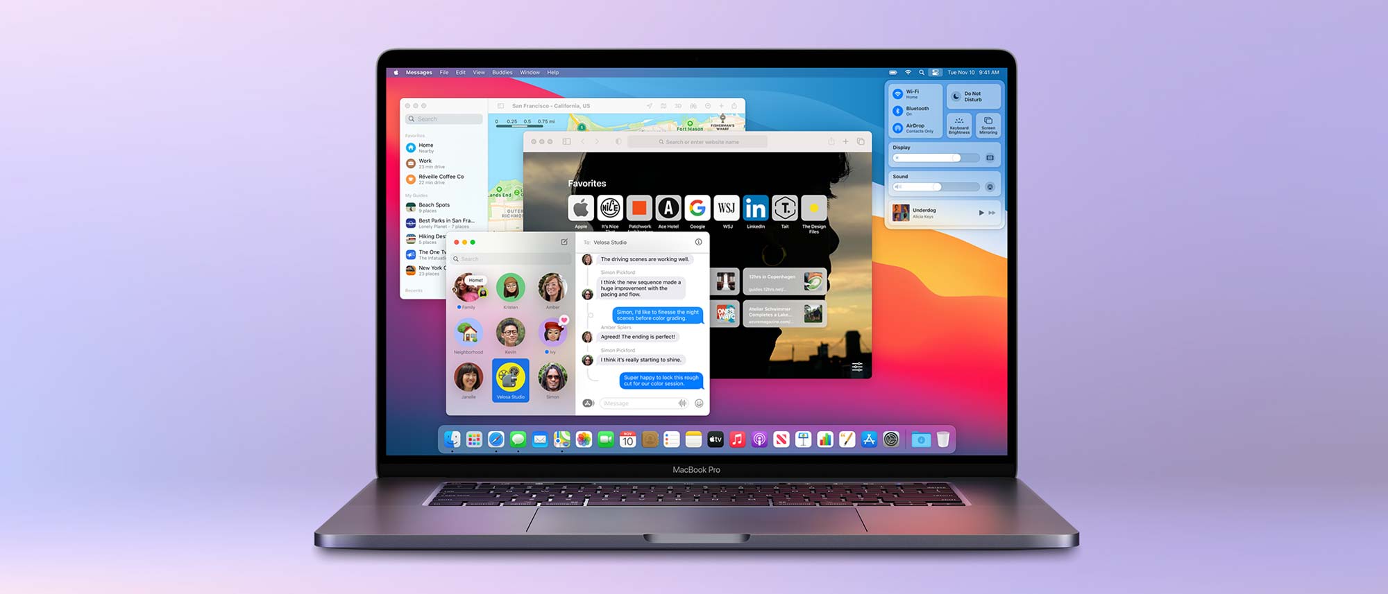
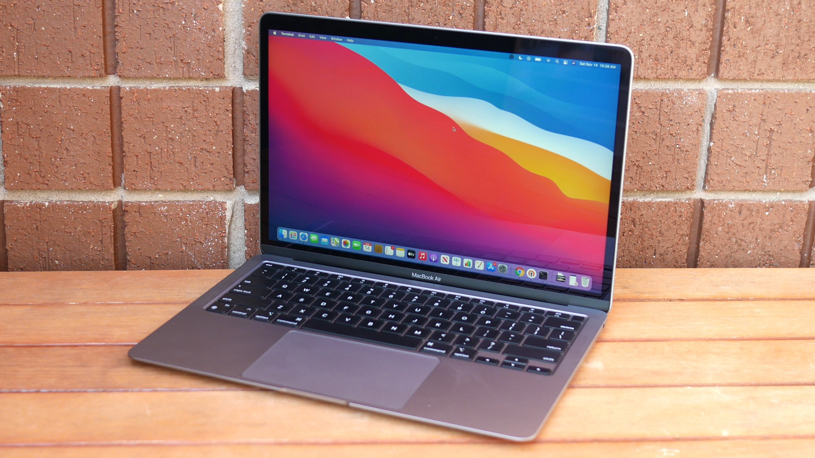
Of all the places to start, appearance seems to be the most logical. From the moment you install the update, you’ll notice a completely reimagined look that features bright colors, round corners, and a transparent UI that you can’t help but compare to iOS and iPadOS.
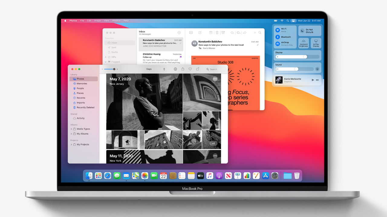
As great as the aesthetic changes are, some of the best additions to macOS Big Sur are those that improve the user experience. One of these is the reimagined Control Center, an addition that’s immediately recognizable to anyone who has used one of Apple’s mobile devices. Here, you’ll find useful customization and usability settings, all hidden in a single menu — an entirely new way to interact with your Mac that doesn’t involve feature-finding journeys in System Preferences, or additional menu bar clutter.
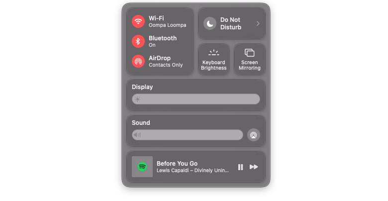
My one gripe is that I could already access most of these items on a MacBook from the keyboard or the Touch Bar (in the case of the MacBook Pro). That said, I still find this to be a useful addition, as these days, most of my typing isn’t done on the MacBook, but an external keyboard while sitting in my home office during a pandemic. Having the option to toggle settings on and off with the mouse, instead of having to reach across the desk to use the Touch Bar, just makes life easier — even easier if you find yourself using your MacBook (or MacBook Pro) in clamshell mode.
In an ideal world, we’d see the new Control Center on a touchscreen Mac, where it would be even more useful, but I’m not holding my breath.
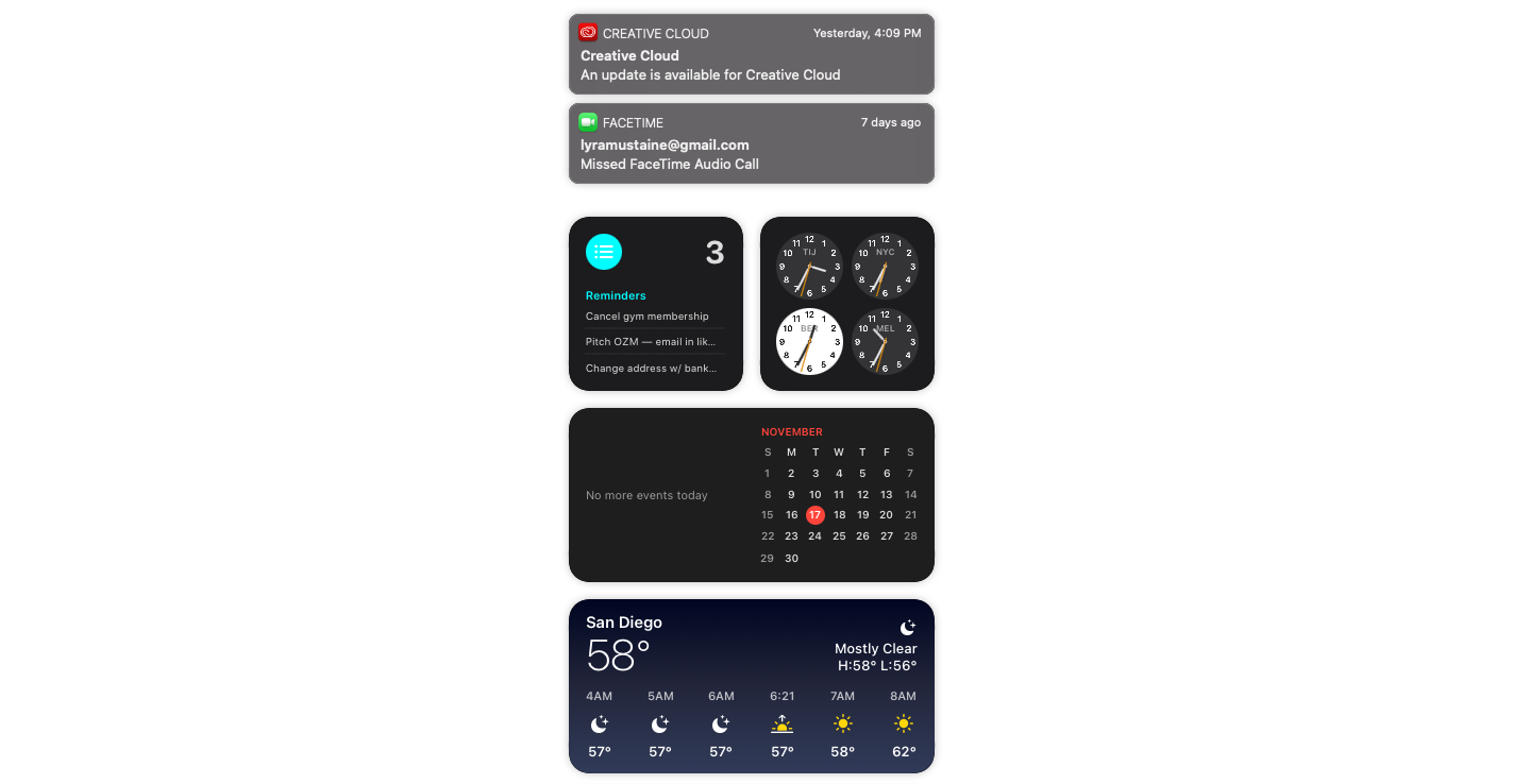
Next to the Control Center is Apple’s much improved Notification Center. You can access the updated Notification Center by clicking on the clock in the menu bar or swiping right with two fingers on the trackpad.
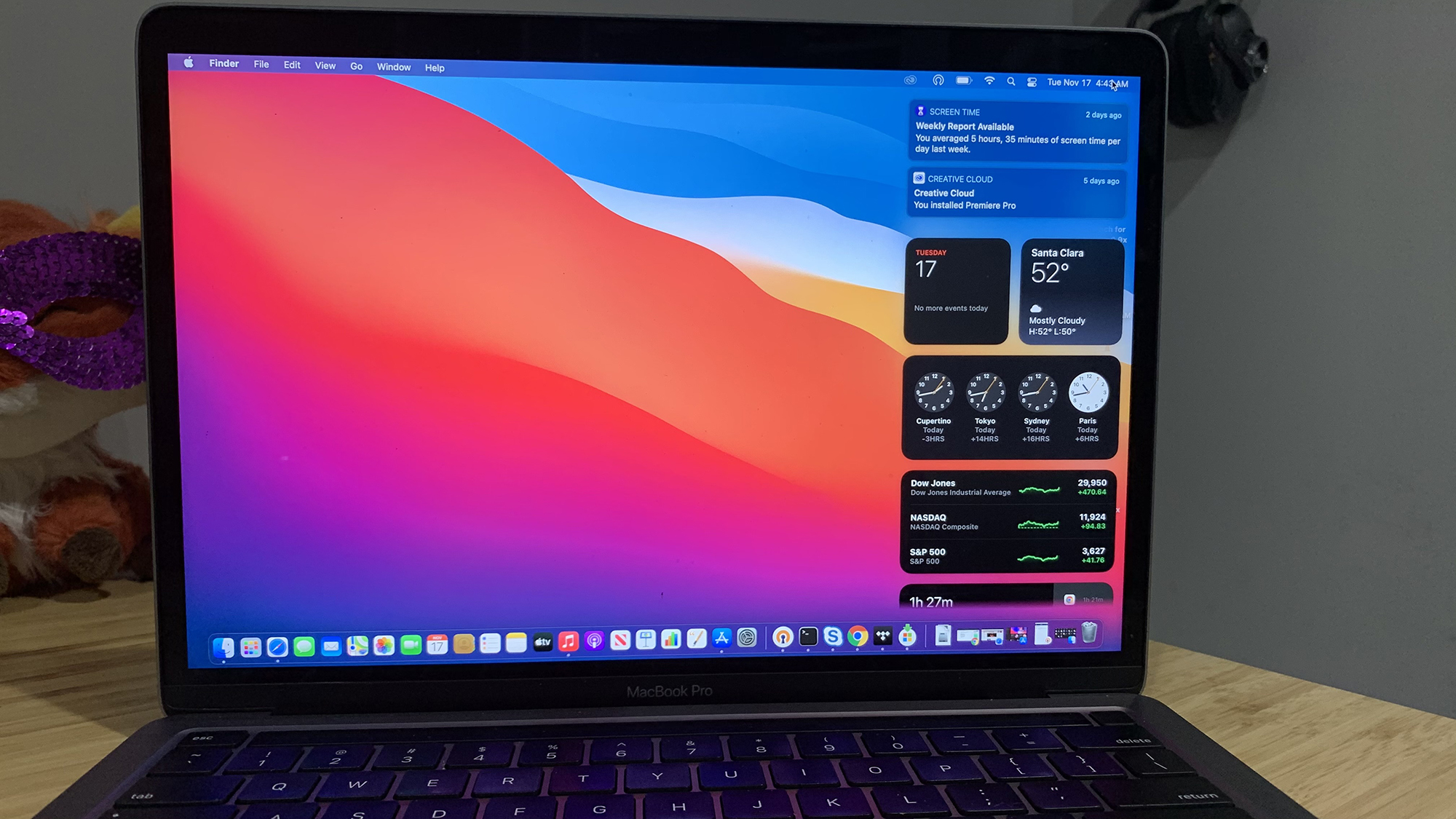
Here you’ll find improved customization options and a number of iOS-like widgets, from shortcuts to the Clock, Calendars, or Podcasts apps, to customizable music widgets, activity monitors and push notifications — which are, conveniently, grouped into one notification now.
The updated appearance is window dressing, not a crucial update, but macOS is more than the sum of its parts. It’s not sexy to talk about rounded corners and transparent menu items, but a few subtle visual tweaks, and some features that were completely reimagined, make a big difference not just in appearance, but the general feeling that this is something new, something special. And let’s be honest, macOS hasn’t felt new or special in years.
It also brings Apple’s mission to bridge the gap between its mobile and desktop operating systems into focus. MacOS Big Sur is one large leap toward a unified operating system across all Apple devices.
macOS Big Sur: Safari
I’ve always wanted to love Safari. And after buying into the hype year-after-year in new macOS launches, it has actually happened. Typically, I make the switch for a month or two after the release, and then lose interest as I remember what I’m giving up by switching to what really seemed like a second-tier browser at times.

While it’s true that Safari’s new features are catch-up tweaks to Chrome, it seems like years of lackluster updates have finally borne fruit. This year’s version of Safari has, for the first time, managed to keep my attention. And after months of using it in beta releases, I’m happy to report that I haven’t switched back, as is usually the case.
In keeping with the updated appearance of macOS Big Sur, perhaps the most noticeable change to Safari is those that bring its appearance in line with that of modern browsers. The addition of favicons, for example, and tab previews — hovering over a tab now shows you the tab itself, without opening — make a big difference in terms of usability.
Safari’s most impressive features, however, aren’t appearance-related. Apple did a lot of work in recent years in making Safari faster than any other browser (at least on a Mac), and the most battery-friendly browser I’ve used (on any device).
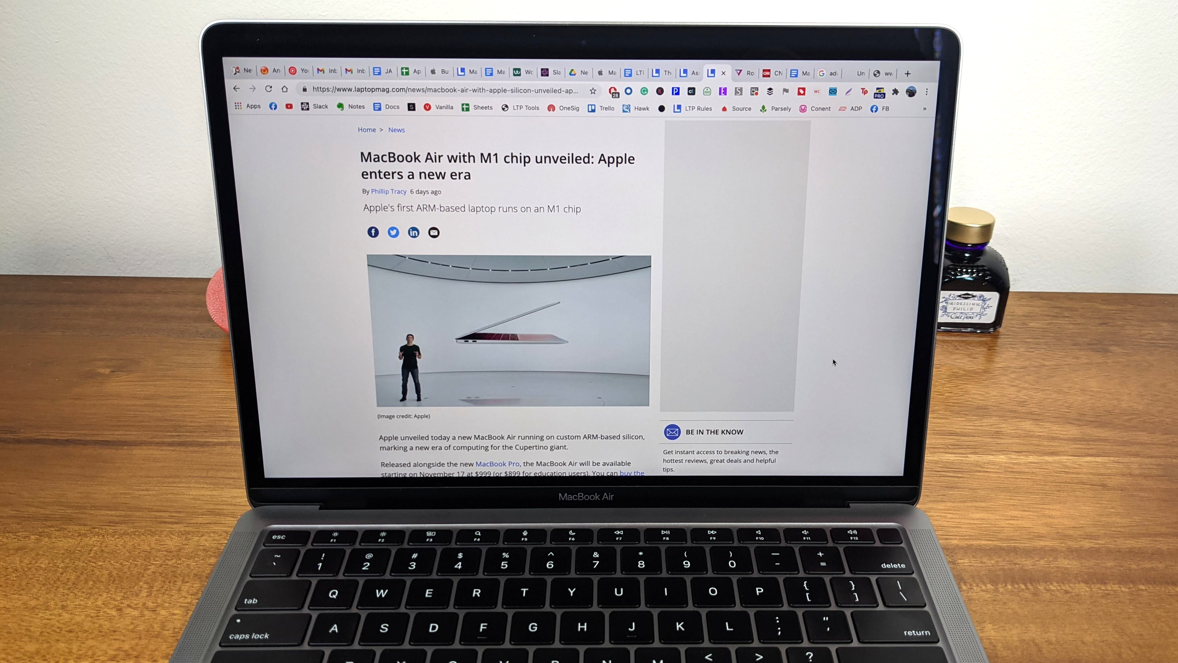
Apple has always been fanatical about efficiency, but recent Safari updates are on a whole ‘nother level. Apple’s latest browser update is reportedly 50% faster at loading frequently visited websites than Google Chrome. But it’s not just faster, it’s more battery-friendly, too. According to Apple, Safari gives you an additional hour of battery life while browsing when compared to Chrome or Firefox, and an additional 90 minutes when streaming online video.
Security got a boost with the addition of tracker blocking and password monitoring which alerts you if one of your stored passwords has been compromised in a data breach. Click the shield in the address bar to get a roundup of what trackers are active on a webpage, and what has been blocked. From here, you gain granular control of what to allow, or to block, on a website-by-website basis.
Another notable change in Safari was made to extensions, which got moved from the Safari menu to their own section in the App Store.
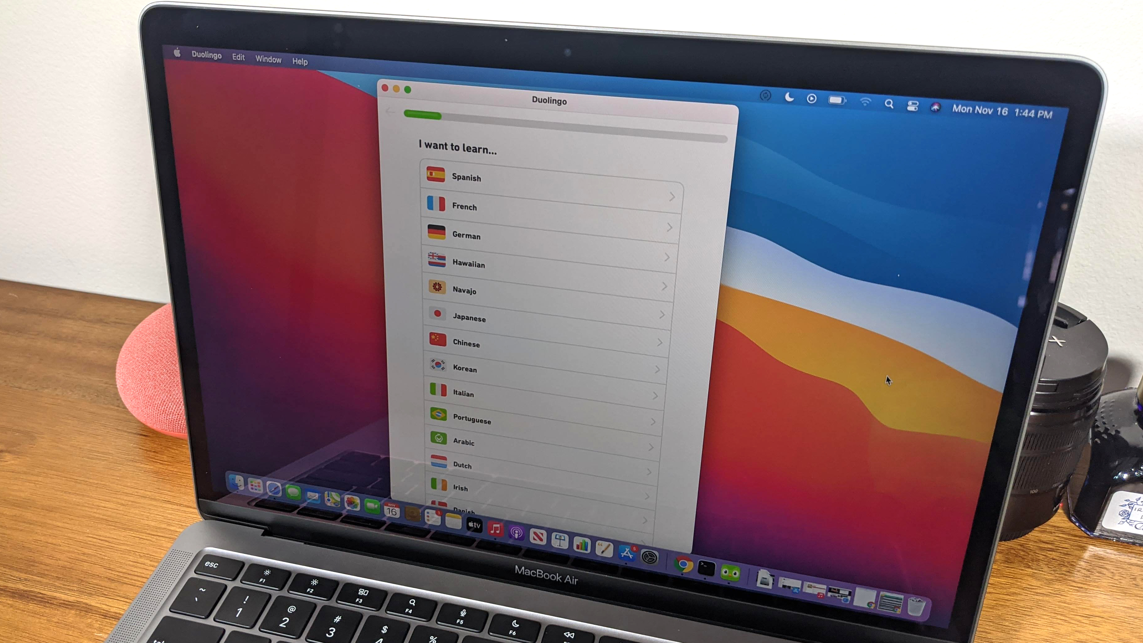
Last but not least is the addition of a first-party translation tool. Chrome has offered this for years now, but Safari finally gives users the ability to translate web pages into a number of languages — though not nearly as many as the Google Translate-assisted feature in Chrome. Still, it’s a start, and it has proven to be a capable one so far. At launch, supported languages are Chinese, French, German, Russian, and Portuguese.
Safari, while much-improved, probably isn’t going to offer enough to make Chrome diehards switch. For those that enjoy the cohesiveness of the Apple ecosystem, however, I can’t really think of any downsides to switching, aside from an oft-used Chrome extension that’s unavailable on Safari, that is. But if battery life and system performance, particularly on a Mac, are important to you, switching really is a no-brainer. It’s time.
macOS Big Sur: Messages
Messages has always been a bit of a paradox. It’s, by far, the most useful messaging app on the market — sorry WhatsApp fans — but it always seemed like it never made full use of its potential. That too has changed in recent years, and it makes another big stepwith the release of Big Sur.

Included this time around are better search functionality, improved group messaging (with group photos), inline replies, @ mentions, and support for multiple pinned messages. Pinned messages have been a useful addition, giving users the option to pin messages from those you chat with often, leaving their messages atop the sidebar even as new messages roll in.
Visually, you’ll also find trending images, memes, and GIFs when you open “#image” or search a keyword relevant to what you’re looking for. You can quickly and easily add these to any of your messages with just a click.
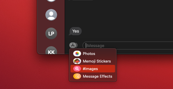
Last, but not least, is an improved Memoji editor. Now you can easily create and edit a Memoji from your Mac rather than doing the heavy lifting on a mobile device.
macOS Big Sur: Maps
Maps, once the butt of all map-related jokes, got a major overhaul this year. It is, dare I say, entirely usable, perhaps even favorable to some of its competitors, for the first time in its life.
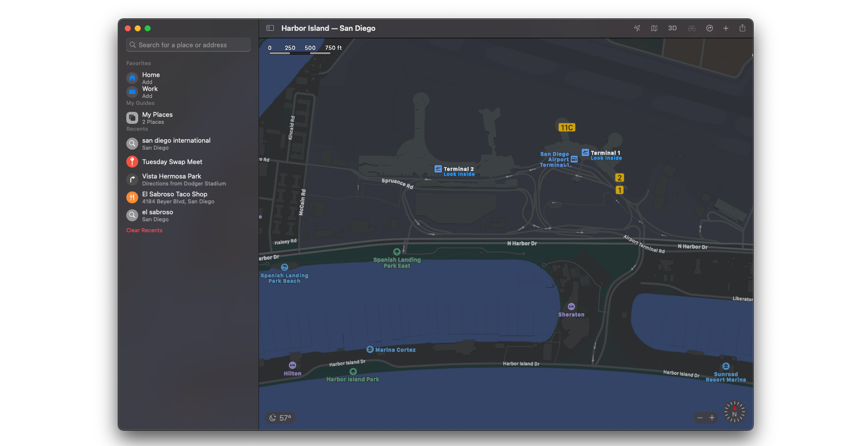
There’s a new tab on the left side that lets you check recent locations and favorites, as well as the option to create your own “Guides” for any trip or destination. These Guides are sort of like a personalized Yelp, or Trip Advisor, that let you add destinations to an itinerary that you can then track from the app itself, plotting routes either in the car, on foot, by bicycle, or public transit.
A Google Street View-esque feature, Look Around, allows you to do a flyover tour of any of the supported cities. It’s not quite as smooth as Google, though it’s not bad for a first effort.
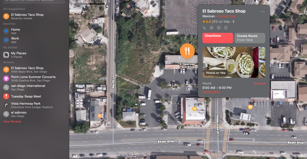
Other stuff includes updates for EV charging, indoor maps for certain buildings (mostly malls and airports), and handy little, Google-esque, bubbles that pop up information from TripAdviser, a street view of the location, and additional information pulled from Google, like reviews and hours of operation.
It’s not that Apple Maps is as good as Google Maps, but you could certainly make the argument that this update has closed the gap to the point where it’s become more of a preference issue than one of usability. That’s really saying a lot, especially considering the hole Maps had to dig itself out of after a disastrous launch and years of mediocrity.
macOS Big Sur: Odds and ends
- Automatic device switching is a cool new feature for those who own AirPods. The feature can detect which device you’re listening to earbuds on, and switch them as you come into range of another device and begin using it.
- Apple Arcade now lets you see which games your friends are playing.
- FaceTime can detect, and prioritize those using American Sign Language in a video call. The feature enlarges the window of these users so that signs are more visible by others on the call.
- Keeping in line with recent privacy-focused updates, you can now see the privacy information of any app on the App Store. App pages now have an easy-to-understand rundown of an app’s privacy practices that you can view before downloading it.
- Once macOS is installed, Apple says that software updates will now begin in the background and download faster than ever, making it a breeze to keep macOS Big Sur up-to-date.
- Optimized Battery Charging is a new addition meant to reduce wear on your battery and improve its life. The feature predicts when it will be connected to a charger for an extended period of time and makes good use of it by learning your habits.
Final thoughts
As we said when we had a look at the beta, macOS Big Sur is Apple’s best release in years, if not a decade. It feels truly fresh and unique, something that’s been hard to say after recent updates to the desktop operating system. But the excitement isn’t lost after you stop noticing the improved aesthetics; you’ll be enamored with a superior user experience, app updates, and features that bring seemingly forgotten applications back to relevance.
Is it worth the download? In a word, yes.
