Laptop Mag Verdict
The Google Nexus 6 delivers blistering performance; a stunning, super-high-resolution display; and the cleaner, more intuitive Android 5.0 Lollipop.
Pros
- +
Captivating quad HD display
- +
Great audio quality
- +
Compelling new design and features in Android 5.0 Lollipop
- +
Impressive performance
Cons
- -
Expensive if off contract
- -
Below-average battery life
- -
Heavy
Why you can trust Laptop Mag
As the company that makes the world's most popular operating system for smartphones, Google wants to ensure that whenever it releases an updated version, there's a shiny and new flagship phone to go along with it. But unlike the Nexus 5, which had midrange specs -- and a fairly affordable $349 price to match -- the Nexus 6 is a premium powerhouse all the way. The Google Nexus 6 ($650 unlocked) sports a large 6-inch quad HD screen, the top-of-the-line Snapdragon 805 CPU and a 13-MP camera. Pair those specs with the arrival of the colorful and more intuitive Android 5.0 (Lollipop), and you have the phablet Android purists have been longing for.
Design
With its curved back and rounded corners, the Nexus 6 looks like a supersized version of the Moto X, and that's not a bad thing. My favorite part about the hardware is the midnight blue aluminum sides, which give the phone a sophisticated air that greatly enhances the dark rear panel. If blue isn't your color, you can also get the Nexus 6 in Cloud White.
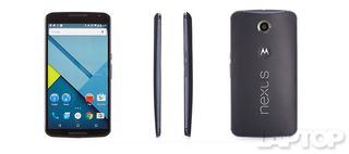
I wish Google had given the Nexus 6 its own version of the MotoMaker site, which lets Moto X users customize their phone designs. The phone would look particularly fetching in genuine leather.
The Nexus 6's nearly 6-inch display takes up the majority of the device's front, leaving just enough bezel at the top and bottom to accommodate the dual speakers and a 2-megapixel camera in the top-right corner.
MORE: 15 Best Apps That Aren't on Android
The backside looks great with Motorola's trademark divot, but the slickness of the plastic makes it a fingerprint magnet that's just a little bit slippery. The embedded chrome lettering spelling out Nexus seems a bit gaudy, but it gets across Google's branding loud and clear.
You'll find buttons for power and volume on the right side of the phone. There's a slot for the Nano SIM, a headphone jack at the top of the device and a microUSB port at the bottom.


Click to EnlargeThe Nexus 6 is rather large, imposingly so. I was able to use it one-handed, but I also have freakishly long thumbs. People with smaller, normal digits will want to use two hands. At 6.5 ounces and 6.3 x 3.3 x 0.4 inches, the Nexus is bigger and heavier than both the 5.5-inch Apple iPhone 6 Plus (6.1 ounces, 6.2 x 3.1 x 0.3 inches) and the 5.7-inch Samsung Galaxy Note 4 (6.2 ounces, 6 x 3.1 x 0.3 inches). However, the Nexus has a bigger screen.
Display
Someone cue up the Robert Palmer, because the Nexus 6's Quad HD (2,560 x 1,440) AMOLED display is … simply irresistible. The iconic opening shot of the aforementioned music video was picture perfect on the Nexus scren. Details were sharp enough for me to see the heavy makeup used to give the models their vacant, doll-like look.

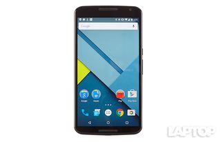
Click to EnlargeWhen I switched to the 1,080p The Wedding Ringer trailer, I marveled at the light playing off the individual strands of the Ignacio Serricchio's jet-black hair and diamond earring. From periwinkle to powder, the phone did an excellent job showcasing all the different shades of blue in Serricchio's shirt. Actor Joshua Gad's brown-and-gray plaid shirt only helped accentuate the stunning blues.
The Nexus 6 can display165 percent of the sRGB color gamut, slightly higher than the Note 4's 163 percent and a lot more than the 6 Plus' 95.3 percent. That means that both the Nexus and the Samsung can display a wide range of color, which can lead to oversaturation.
Sadly, the Nexus 6's color accuracy could be improved. Its Delta-E score of 6.5 is well off the mark from a perfect 0 and higher than the 4.3 smartphone average. The Note 4 scored somewhat better, with 4.2, while the 6 Plus measured 1.9.
Despite its super-vivid colors, the Nexus 6 isn't that bright. The phone registered only 273 nits, well below the 367-nit average.
Audio
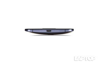
Click to EnlargeThe Nexus 6 is part of a growing number of smartphones with front-facing speakers, a trend I hope continues. The phablet filled my medium-size test space with loud, generally balanced music, but had some difficulty dealing with treble at maximum volume, often distorting vocals.
I enjoyed the deep bass, floaty keyboard and crisp snares on Willow Smith's "8." However, her birdlike soprano voice sounded harsh when she hit some of the higher notes. When the young chanteuse settled into an ennui-laden alto, I could fully appreciate the spacious soundscape.
At 91 decibels, the Nexus 6 outgunned the HTC One M8's BoomSound speakers (83 dB), which provide some of the best audio output on the market. The 6 Plus and Note 4 are quiet by comparison, at 78 dB and 81 dB, respectively.
Welcome Android 5.0: The New Lollipop Guild
The more I use Lollipop, the more I love it. Google's newest version of its mobile operating system, also known as Android 5.0, offers clean visuals and an intuitive user interface with compelling features -- some of which were borrowed from Motorola.
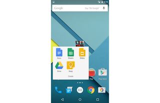
Click to EnlargeOne of the first things you'll notice is Android's new look. Lollipop uses an iOS 8-like Material Design, which incorporates bold color and patterns with a flatter, more streamlined aesthetic. The interface has large, brightly colored apps with a construction-paper look that I really like. I especially appreciate that Google took the time to create folders for most of its pre-installed apps, such as Docs, Sheets and Slides.
Lollipop ditches the distracting black status bars from previous Android iterations. Now the status icons are on top, and capacitive touch buttons (for Back, Home and Recent Apps/Tabs) seem to float over top the home screen. You don't gain any real estate, but it feels like you do.
MORE: 12 Surprising Things Your Android Phone Can Do
The lock screen has a few time-saving improvements. Phone, Unlock and Camera icons are smaller and stashed strategically along the bottom of the lock screen, waiting for a right, upward or left swipe, respectively, to spring into action. To access an email from the lock screen, I simply double tapped on the corresponding notification. The Glance feature, similar to what's found on the Moto X, flashes the time and recent notifications when you gently jostle the phone.
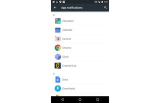
Click to EnlargeUnlocking the phone reveals that Google has done some major downsizing, reducing the number of initial home screens from seven to two. However, if you need more screens, you can drag an icon over to the far right of the screen to access another panel. Swiping all the way to the left takes you to Google Now and a myriad of customizable cards. Google Now can also be accessed by swiping up from the Home button or saying, "OK, Google."
Has Google finally combined the Quick Settings menu with the Notifications Shade? Not exactly. As always, swiping down reveals the Notifications. Similar to what happens with the lock screen, notifications are displayed as a series of white cards accented with a colorful logo. If you go to the Settings menu, you can set up which notifications are displayed and arrange them by priority. I gave Gmail, Calendar and Hangouts top billing, ensuring that they rose to the top of my list.

Click to EnlargeSwiping down on the gray box above Notifications reveals a streamlined Quick Settings box with a slider for Brightness and icons for Wi-Fi, Bluetooth, Airplane mode, Auto Rotate, Flashlight and Cast screen for mirroring your display. It's a slicker, easier-to-use presentation than the Samsung TouchWiz interface, which employs a kitchen-sink approach to Quick Settings, giving people access to an overwhelming 19 options.
Long-pressing the Home button launches Google Now, but the Recent Apps buttons have been stripped of their ability to toggle the home screens.
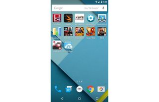
Click to EnlargeThe Recent Apps menu looks largely similar to the KitKat card presentation, with a couple of key differences. For starters, Lollipop incorporates a wider range of colors, using orange for Google Play Music, red for Google+, black for Settings and light gray for Web pages.
To make it easier to switch between Web pages, the Recent Apps menu now lists each browser tab as its own card, rather than giving you just one entry for the browser as in previous versions of Android. However, I found rifling through a bunch of digital cards, trying to find my previous search for a creamed corn recipe, a little annoying. I couldn't shake that feeling of cycling through a Rolodex like I was back in the '80s.

For all the good things Google has packed into Lollipop, the company has refused to add the multi-window features Samsung and LG have been building into their Android skins for years. Why not give people a way to do two or more things at once on this 6-inch display?
Google Now
Similar to Siri, the new Google Now can send text messages. It was as simple as saying, "OK, Google, text Avram Piltch, do you want to order lunch?" The phone immediately pulled Avram's phone number and crafted my message. I responded, "yes," when it asked if I wanted to send the message, and off it went -- without me having to lift a finger. I didn't even have to turn the display on, thanks to the newly included option to access Google Now when the screen is off -- a simple "OK, Google," and I was good to go.
However, enabling this feature could pose a potential security threat, as someone could utter the magic phrase and gain access to your device.
Device Sharing
Tapping the blue icon in the top right corner of the Notification Shade reveals the User menu for the Device Sharing feature, one of my favorite Lollipop features.
The device can support up to four user accounts, along with one Guest profile with limited app access. I added my Google account to the Nexus 6, which was already registered to another colleague. After that, I could access all my Google-related information, including my contacts, Gmail and photos saved to Google Photos. Any apps I downloaded to my profile did not appear on the other account, allowing both of us to have a truly independent experience on the same device. The profile even saved our lighting and security preferences.
MORE: 10 Android Apps You Should Download Now
Although I could access all my contacts, I couldn't make calls or send text messages until given permission in the Settings menu from the primary account.
Overall, device sharing is a slick solution if you misplaced your Lollipop device and need to make a call. It can also come in handy if you want to let your child use the phone without gaining access to all your apps.
Keyboard
Just like the rest of Lollipop, the new keyboard, christened Material Light, is lighter, faster and much easier to use than its predecessors. I was excited to see that Google ditched the blah-inducing, blocky, dark-gray keyboard in favor of a lighter color and a more seamless presentation.
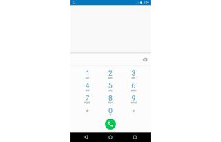
Click to EnlargeThe letters are large and easy to read, but it would have been nice to have a dedicated number row, especially on a screen this size. I also would have preferred more-pronounced haptic feedback.
The lack of spacing between the keys makes the keyboard better suited to swipe typists rather than the hunt-and-peck crew. Swiping or gesture typing was as smooth as silk, and the rich turquoise trail created by the trace path added a wonderful pop of color. I was rather impressed with the word-prediction feature. More than few times, I swiped my thumb over the screen just to see what word Google would come up with.
Apps
Bloatware? What bloatware? The Nexus 6 packs nothing but the apps Google created, which means that the majority of these apps are at least somewhat useful. Google was even nice enough to bundle most of its apps in three separate folders, titled Google, Create and Play.
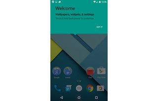
Click to EnlargeThe Google folder contains the usual suspects, such as Gmail, Maps, YouTube, Photos, Search, Calendar and Google+. When it's time to do some work, the Create folder has Docs, Sheets, Slides, Drive and Keep, the note-taking app. Want to indulge in a bit of multimedia? The Play folder has you covered with the Play-branded Movies, Music, Games, Books and Newsstand apps.
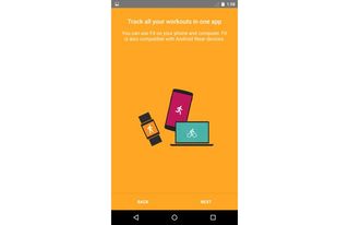
Google also got the exercise bug with its new Fit app, which can track your steps. Similar to Samsung's S Health, Google Fit relies on the Nexus 6's built-in accelerometer and gyroscope to keep track of all your movements.
During my test run with the app, it documented all my steps of the day for a week, creating a helpful bar chart of my activity. Similar to other health apps, Fit can be paired with Android Wear devices such as the Moto 360 and the LG R Watch or third-party apps such as RunKeeper.
Performance
Click to EnlargeA powerful interface needs an equally potent processor. The Google Nexus 6 has found its match in the 2.7-GHz quad-core Qualcomm Snapdragon 805 CPU with 3GB of RAM. Throughout my time with the smartphone, I encountered zippy performance, without the faintest hint of latency.
Bullets whizzed through the air as my squadron stormed a beach in Modern Combat 4 Zero Hour. The action stayed smooth even after I cranked the special effects up to high.
The phone produced a score of 3,196 on Geekbench 3, which measures overall performance. That easily topped the 2,184 smartphone average and the Apple iPhone 6 Plus (Apple A8 processor), which scored 2,093. The Samsung Galaxy Note 4, which has the same CPU and RAM as the Nexus, obtained 3,124.
Taking 12 seconds to launch N.O.V.A. 3, the Nexus 6 was just a few tenths of a second faster than the Note 4, which started the game in 12.7 seconds. It took the iPhone 6 Plus only 5 seconds to start the game, but that may have more to do with the different platform.
On the VidTrim test, which involves transcoding a 203MB 1080p file to 480p, the Nexus 6 finished in 4 minutes and 59 seconds. That's much faster than the 7:02 average and better than the Note 4, which posted a time of 5:15.
On 3DMark Ice Storm Unlimited, which tests graphical performance, the Nexus 6 hit 15,904, beating the 14,521 average. Both the iPhone 6 Plus and Note 4 scored better, notching 16,965 and 20,126, respectively.
Our review unit of the Google Nexus 6 came with 32GB of storage, but Google also has a 64GB configuration on the Nexus homepage, priced at $699. Unfortunately, there's no microSD slot, so you'll have to be mindful when downloading bigger apps or games.
Camera
The Nexus 6's 13-MP camera did a good job delivering accurate detail, but it isn't the best smartphone shooter. In a mini shoot-off against the Apple iPhone 6 Plus and the Samsung Galaxy Note 4, the Nexus landed smack dab in the middle.
In a test shot of red roses and white baby's breath, the Note 4 had a bluish tint, which made the roses look darker and washed out much of the white in the image. The Nexus 6's photo had the more realistic color of the three shots, while the roses in the 6 Plus' shot were somewhat oversaturated, to the point of having a slight glow.
The iPhone produced the most detail, showing off velvety flower folds and pronounced veins on waxy green leaves. The Note 4 displayed most of the same details. The Nexus 6 failed to capture several dark green leaves, making it appear as if there were a black hole in the center of the image.

Click to EnlargeA word of advice for those trying to capture a low-light shot with the Nexus 6: Find a light switch. In a photo of myself and a fellow staffer taken without flash, we were bathed in shadow, which obscured most of our faces. The Note 4 captured more light, showing off more of my coworker's red and blue plaid shirt. The 6 Plus delivered the best result in terms of lighting, allowing me to see the creases and wrinkles in both of our shirts. However, my skin had a yellow tint.
A steady stream of bright yellow cabs whizzed by in the 1,080p video I captured with the rear camera. Text such as the American Apparel banner and the 5th Avenue street sign were clearly legible.
When I switched to 4K resolution (2,560 x 1,440), I noticed that the camera had difficulty staying in focus and looked a little blown out. However, color looked brilliant, and I couldn't help but feel a bit patriotic as the American flag flapped majestically in the wind.
The front-facing 2MP camera captures decent photos, although I found that my warm brown complexion looked washed out. However, I was impressed with the level of detail, including the pilling along the interior of my dark gray fleece.
Camera Features
The Google Camera app doesn't have all the bells and whistles that Samsung and Apple tout, but it does have a few compelling tricks up its sleeve. For instance, when you're done snapping a photo, you'll see an edge of the completed shot peek out from the side, cueing you to swipe right to access the gallery.
Click to EnlargeThe Photo Sphere feature is like Panorama on steroids, allowing photogs to stitch together images to create a 360-degree shot. Viewers can explore the resulting image from any direction they wish.
The app does its best SLR impersonation with the Lens Blur feature, allowing users to adjust the depth of field. That allows the picture to focus on the subject in the foreground while creating a stylish, blurred look in the background ... at least that's what should happen.
In practice, I found Lens Blur easy to use, but difficult to master. After numerous tries, I was able to get the best shot of my Rei Ayanami figurine by standing within 5 feet of the subject and slowly moving the camera upward when signaled. Even then, the shot wasn't perfect, as I could see an unblurred portion around the wing area.
Battery Life
As we saw with the LG G3, high-resolution screens can have a negative impact on battery life, which seems to be the case with the Nexus 6. On the Laptop Mag Battery Test (Web surfing via LTE at 150 nits), the Nexus 6's 3,220 mAH battery lasted 7 hours and 5 minutes on Verizon's LTE network, and 6 hours and 57 minutes on AT&T's LTE network. That's well short of the 8:30 smartphone average, as well as the Note 4's 8:43 and the iPhone 6 Plus' 10 hours.
Whenever the Nexus 6 is being charged, the lock screen will display how much time is left until the phone reaches a full charge. Conversely, when the phone is not being charged, you can check how much time is left before the battery conks out in the Settings menu under Battery.
MORE: Smartphones with the Longest Battery Life
Motorola claims its turbo charger can provide the Nexus 6 with up to 6 additional hours of battery life. After 20 minutes, a completely dead Nexus 6 was charged to 27 percent. Not bad, but nowhere close to 6 hours.
Pricing
Off contract, the unlocked Nexus 6 costs $650, a bit less than the other phablet flagships on the market: the iPhone 6 Plus ($749) and the Galaxy Note 4 ($699). Sprint will offer the Nexus 6 for $0 down and 24 payments of $29 each, which comes out to $696. On AT&T, you can purchase the phone for $250 with a two-year contract, or $682.99 off-contract. Consumers can also pay for the Nexus 6 in monthly installments of $22.77, $28.46, or $34.15, depending on which Next plan they choose.
We will add additional carrier pricing as they become available.
Bottom Line

Click to EnlargeIf clothes make the man, operating systems make the phone. On its own, the Google Nexus 6 is a great flagship phone with a formidable Snapdragon 805 CPU, vibrant Quad HD screen and jaw-dropping audio quality.
However, Android 5.0 (Lollipop) makes the Nexus 6 sing. The new Material Design is not only cosmetically pleasing, but also highly functional. The redesigned menus and overall aesthetic are light touches that make a world of difference when it comes to ease of use. Once you start using the Nexus 6, it just feels right.
The iPhone 6 offers much longer battery life in a slimmer and lighter design, as well as a better camera. And the Galaxy Note 4 offers better multitasking features and pen input. However, the Nexus 6 is the phone to buy if you're an Android purist who wants the next big thing, both literally and figuratively.
Google Nexus 6 Specs
| Bluetooth Type | Bluetooth 4.0 |
| Brand | |
| CPU | 2.7-GHz quad-core Qualcomm Snapdragon 805 CPU |
| Camera Resolution | 13MP |
| Carrier | Verizon |
| Company Website | www.google.com |
| Data | LTE |
| Display (main) | 5.96 inches |
| Display Resolution | 2560 x 1440 |
| Form Factor | Candybar Touchscreen |
| Front Camera Resolution | 2MP |
| Memory Expansion Type | none |
| Networks | GSM: 850/900/1800/1900 |
| OS Family | Android |
| Operating System | Android 5.0 |
| Phone Display Size | 5.9 |
| Ports | Nano SIM, 3.5mm headphone, microUSB |
| Processor Family | Qualcomm Snapdragon 805 |
| RAM | 3 GB |
| Size | 6.3 x 3.3 x 0.4 inches |
| Talk / Standby Time | up to 24 hours/up to 330 hours |
| Weight | 6.5 ounces |
| Wi-Fi | 802.11ac |

Sherri L. Smith has been cranking out product reviews for Laptopmag.com since 2011. In that time, she's reviewed more than her share of laptops, tablets, smartphones and everything in between. The resident gamer and audio junkie, Sherri was previously a managing editor for Black Web 2.0 and contributed to BET.Com and Popgadget.