Laptop Mag Verdict
Now offered free for all new Mac buyers and current iWork owners, iWork is an excellent productivity suite for OS X users.
Pros
- +
Free for all new Mac buyers
- +
Nice UI redesign
- +
New toolbars and contextual sidebar makes content creation quick and easy
- +
Powerful enough for most uses
Cons
- -
iWork for iCloud beta lacking a few features
- -
No pivot tables in Numbers
Why you can trust Laptop Mag
Apple's iWork suite -- which includes Pages, Numbers and Keynote -- is Apple's version of the Microsoft Office productivity suite and Google's Drive. With the launch of OS X 10.9 Mavericks, Apple has completely rebuilt the software with a new UI, a new formatting panel and a consistent file format for cross-platform document parity. Even better, Apple is providing the suite for free to current iWork owners or to anyone who buys a new Mac or iOS device. But is the new iWork suite good enough to convince Microsoft Office for Mac and Google Drive users to make the switch? Read on for our full review.
Pages

Click to EnlargePages is iWork's word-processing solution, used to create all kinds of professional documents. Apple has completely redesigned Pages for Mac, making it much more intuitive to access the tools you'll need most. When you first launch the app, you'll be able to create a new blank document, or select from one of Apple's 60+ ready-to-go templates, including several new ones created just for this version.
Apple is no slouch when it comes to design. In each open document, the toolbar provides options that let you change the view and zoom level, as well as insert tables, charts, text boxes, shapes, comments and media content. The top-right section of the toolbar houses a new button with the option to share via Mail, Twitter, Facebook and Messages. You'll also find tips for using Pages, formatting options and a setup area.
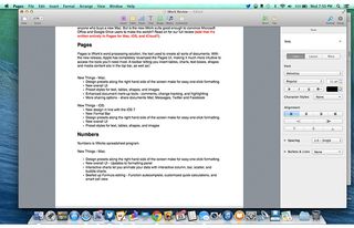
Click to EnlargeThe format panel sidebar, unique to the Mac version of Pages, is where the new design truly shines. This is where you'll find most of the editing tools you need to create content. We liked that the tools available to you contextually change based on the type of content you're using. When you're just typing, there are the standard options for text formatting (bold, italic, underline, etc.); ways to change the font, spacing and text alignment; and bullet management. You also can choose from one of Apple's new preset formatting styles for headings, captions, titles and footnotes.
MORE: Game Changer Awards - The Most innovative Tech of 2013
If you're adding media content, the sidebar changes to give you powerful new ways to edit your image within the documents, including options to resize the image, and change exposure, saturation levels and the alignment of the text around your image. When you're working with tables, you can customize the look of your table with preset designs, adjust fonts and borders, and change the data format. Microsoft Word provides more options for customizing tables, but we found that Pages gave us better-looking tables.
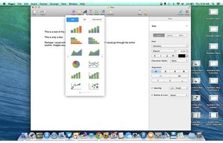
Click to EnlargeWith the new Mac release, Apple has added additional commenting and markup tools to aid users in revising and editing documents. Intelligent wrapping automatically wraps text around inserted images, and the wrapping intuitively changes as you move the image around the screen to find the perfect spot. You can also add several new interactive charts, which animate your data to give users a better understanding of the information you're trying to convey. The markup tools bring Pages on a par with Word's powerful markup tools, and intelligent wrapping and interactive charts offer unique, new ways to modify your documents.
Overall, we found that Pages let us create good-looking, well-formatted documents with a consistent look across all of our Apple devices. Pages does an excellent job of putting the tools you need front and center so you can quickly and easily crank out your documents.
Numbers

Click to EnlargeNumbers is iWork's spreadsheet program, used primarily for number crunching, statistical analyses and basic formula work. Like Pages, Numbers was built from the ground up with usability and interoperability in mind. When you launch Numbers, you'll be presented with more than 30 spreadsheet template options, several of which are new.
In Numbers, you'll find the same familiar toolbar at the top, with one-click access to many ways to enhance your documents with charts and media, and the sharing area to let you collaborate with others. You'll also find the contextual sidebar format panel.
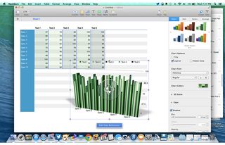
Click to EnlargeWhen you're working in a table, for example, four tabs are available to help you format the cell, text within the cell, alignment, and the overall look and feel of the table itself. When you create a chart or insert media, however, the sidebar will let you change the formatting, and how the chart and image look within the larger document, as well as manipulate the data used to create the charts.
The interactive-chart tool is one of the more useful features added to Numbers. When you're working with a series of data, you can create charts that include buttons and scrollbars, which animate your charts to make them come to life on the screen. For example, say you're analyzing a product and want to understand its sales trends. Simply create a table with the appropriate data, and create an interactive chart. The chart will feature a slider that you can use to scroll through individual months to see how the sales are trending. In many situations, interactive charts can present information in a much more meaningful and understandable way than typical static charts can, and this feature helps Numbers stand out from the pack.

Click to EnlargeAnother enhancement we really like in Numbers is the beefed-up formula editing. There are several additional formulas Apple has added to its repertoire, and formulas now auto-complete to save time getting the answers you need. If you select a bunch of cells, a bar appears at the bottom of the display, with several basic calculations -- like sum and average -- already completed, making for quick and easy calculations even without formulas. Other new Numbers features include better formatting options and enhanced conditional formatting.
One capability that Numbers still lacks that's a mainstay in most corporate offices is the ability to create Pivot Tables, which provide Microsoft Excel users a way to create easy reports with big data tables. Though you can essentially replicate this in Numbers, the process is complex and not as intuitive as it is in Excel. Apple has made great strides with Numbers, but it has some catching up to do if it's going to handle much more than basic spreadsheets and charts.
MORE: Apple: Tech Support Showdown 2013 Rating
Keynote

Click to EnlargeKeynote is a tool used to create powerful and stylish presentations. It, too, has been rebuilt from the ground up with Mavericks. Of course, as we've come to expect with Pages and Numbers, several new themes were added to Keynote, with more than 30 options available to you upon the program's launch.
Once you open Keynote, you'll find the same changes to both the toolbar and sidebar formatting panel as in Pages and Numbers, though there are a few tweaks appropriate for working on presentations. In addition to the standard new toolbar, two additional buttons -- one to start the slideshow you've created, and the other to create and edit animations and transitions -- have been added to the mix.
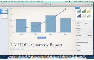
Click to EnlargeThe contextual sidebar format panel in Keynote lets you format text, images, slides, tables and more when you're working with those types of content. You'll also find animation and transition features that jazz up your presentation with animations. We found that, as on Pages and Numbers, each of these actions was intuitive and helped make content creation easy.
In addition to the UI enhancements consistent with the rest of the iWork suite, Apple added new, cinema-quality transitions to its slide-animation function. Magic Move maintains these animations whenever the same information is presented on multiple slides.
The new transitions added to an already impressive array of the effects in previous versions of Keynote, and Magic Move solves one of the formerly frustrating aspects of using transitions. If you have the same data, charts or tables on multiple slides, Magic Move will assign the same transition effect to these slides once enabled -- so you no longer have to choose the same effect repeatedly to create a consistent presentation.
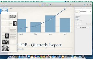
Click to EnlargeWith a new image-editing functionality built-in, Keynote users no longer need a stand-alone application to make basic enhancements to their images. Keynote also lets you use the interactive charts and bubble charts prominently featured in Numbers, and you can add animations to those charts for an added effect.
MORE: Apple's Best and Worst Notebook Brands 2013 Rating
Apple also fully revamped the Presenter Display within Keynote. With the new Presenter Display, you can edit notes on the fly as you're presenting, access the slide navigator and jump to any slide from within the display itself. One downside is that you can no longer customize the Presenter Display, apart from enabling/disabling sections. If you rely on notes to get you through a presentation (and many of us do), you either have to use a tiny notes bar at the bottom of the screen or disable everything else for a full-screen view. This frustration aside, the Presenter Display is a handy tool to help get you through your presentation with ease.
In a way, it seems appropriate that Keynote received only minor updates, as this program has long been the best and most functional iWork app. Though Microsoft PowerPoint has more templates and features, Keynote arguably has better transitions and is more intuitive for newbies. And with the added sharing features brought to the iWork suite, Keynote has just become an even better solution for presentations, cementing its place as the must-have presentation app for Mac users.
iWork for iCloud beta
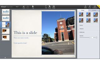
Click to EnlargeiWork for iCloud beta has all of the functionalities of iWork for iOS and OS X, but its design is a bit lackluster. The Web-based productivity suite still looks as though it belongs in the world of iOS 6, with rounded charcoal gray edges and white settings icons, not the colorful, flat world of iOS 7 and OS X Mavericks. It also looks a bit bland compared to recent enhancements to Office 365 and Google Drive, and we'd like to see Apple redesign these apps with Apple's new design in mind.

Click to EnlargeAesthetics aside, iWork for iCloud beta brings much of the functionality of its Mac suite to the Web, letting users create and edit documents, spreadsheets and presentations from within a Web browser. Many of the same tools we grew to like in the Mac apps, such as interactive charts in Numbers and basic image-editing tools in Pages, made their way to the iWork for iCloud beta suite. Though the overall design is lacking, the features available at the user's disposal lets you create stunning documents needing nothing more than a Web browser.
The biggest change to iWork for Mac and iOS is the consistent file format -- all of your documents look and function in the same way on Mac, iOS, and the Web suite. This is particularly helpful for those who don't exclusively use Mac products, as documents are now stored in iCloud by default. Now, iWork users can edit documents created in Mac or iOS on any device, without missing a beat.
Perhaps more important, iWork for iCloud beta opens up the collaborative functionality of iWork by letting anyone with a computer contribute to iWork documents, though this functionality is still a bit rough around the edges, despite recent enhancements.
MORE: How to Set Up iCloud Keychain on Mavericks or iOS

Click to EnlargeBoth Google Drive and Office 365 have come a long way in what they can offer from a formatting standpoint. In our testing, we found iWork to be roughly on a par with these products when it came to formatting documents, but we noticed it lacked some features found in Office 365. For example, in Word's Web app, you can easily add tables to documents -- a capability that Pages lacks. In Excel's Web app, you can easily arrange data using the Sort function, which doesn't exist in Numbers. Aside from these few shortcomings, however, it's easy to create good-looking documents using the browser-based iWork suite alone.
Overall, we'd like to see Apple bring the new design of iOS 7 and OS X 10.9 Mavericks into the Web-based iWork for iCloud beta suite, but we're happy with the level of functionality Apple brought to the product. We found it was easy to use the Web version of these Mac apps, even on a Windows machine.
Collaboration

Click to EnlargeApple's addition of collaboration tools to the iWork suite is a big deal. Indeed, gone are the days when people worked in isolation, as collaboration is now the standard in most corporate offices. With the addition of collaboration tools in iWork for iCloud beta, Apple has caught up with Google Drive and Microsoft Office 365 in creating a product that embraces this new workplace standard -- at least in theory.
In practice, the collaboration functionality in its current form is limited compared to the competition's offerings. A recent update added sorely needed tools that let users know who else is editing a document and where they are physically positioned within a document. But there's still no way to chat with the other person aside from a third-party application. This is one of the most helpful features found in Google Drive, and Apple needs to bring this feature to iWork for iCloud beta for people to use it as a serious collaboration tool.
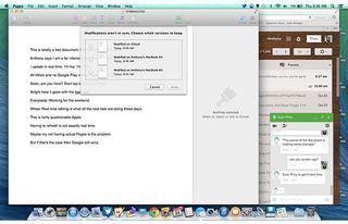
Click to EnlargeMore important, there's no revision history anywhere to be found, so any changes made to the document are permanent, unless you use the modestly useful Undo button. In Google Drive, for example, we frequently revert to previous versions of documents when we've made an accidental change, and there's no way to do so with iWork. You also lose some of the markup features brought to the iOS and Mac versions of the iWork apps.
We had the best experience when both collaborators were using the iWork for iCloud Web app. When one user was in Pages for Mac, for example, and another in the Pages for iCloud beta Web app, changes made by one user weren't made at the same time, and you essentially end up with two (or more) documents that you need to reconcile later, resulting in more work to get the document the way you want it.
MORE: 7 Ways Apple Should Fix iOS 7
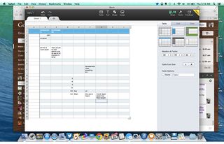
Click to EnlargeApple told us that fixes to many of the gripes we had with iWork for iCloud beta would be coming in future versions of the suite.
Overall, collaboration in iWork for iCloud beta is off to a decent start but is missing a few features needed in a true collaboration tool. Recent additions make the suite much more compelling than when the product initially launched, but the lack of a chat client and some of the more helpful markup features leave iWork for iCloud coming up short.
Verdict

Click to EnlargeApple's new iWork suite is no small upgrade; it's a full reimagining of what work looks like in the new era of tablets and smartphones. iWork is powerful enough for most uses; the new design is elegant and simple to use, and the new formatting sidebar puts all the tools you need on the screen when you need them. Plus, the fact that documents now look the same whether you're viewing them on Mac, iOS or the Web eliminates the frustrations typically found when working across platforms, and allows for easy collaboration via iWork for iCloud.
To accomplish this platform parity, some features -- such as autocomplete, in Numbers -- were removed, but Apple said it will add several of the features back to the suite in a future update, and the company promises that new features are on the way as well.
Users sitting outside Apple's ecosystem will obviously have little incentive to switch, as Google Drive particularly does a better job with collaboration functionality compared to iWork for iCloud beta. Nevertheless, iWork is a compelling content creation platform for Mac owners.
iWork for OS X (2013) Specs
| Company Website | http://www.apple.com |
| Platforms | Mac |
| Software Required OS: | OS X Mavericks |
| Software Type | Business Software |


