Laptop Mag Verdict
Microsoft Sway isn't designed for your big presentation, but it's perfect for personal presentation projects you want seen on the Web.
Pros
- +
Storyboard-based presentation creation
- +
Imported outlines from Word create instant presentations
- +
Final Web-presentation looks great on all devices
Cons
- -
Very limited customization options
- -
Prepackaged templates have basic appearance
- -
Occasional hangs after continued use
Why you can trust Laptop Mag
At first glance, it's easy to overlook Microsoft's Sway, a Web-based presentation tool released last October and now newly available as a desktop application for Windows 10. It is, after all, another app designed to "get your stuff out there so people can see it," à la Tumblr, YouTube, Instagram and any one of a number of different apps. Sway seems like piling on where the pile is already pretty high.
But overlook Sway at your peril. Microsoft's app deserves a look because of how it does what it does and the ease with which it does it, helping you turn your most rudimentary ideas into Web-based presentations that deliver those ideas with little effort. Rather than matching up against full-featured programs like Microsoft's own PowerPoint, Sway's closest competition is Prezi, another online tool that works exactly like desktop presentation applications. You'd get far more control over text and images in a program like Prezi, but Sway is trying to win out by emphasizing the simplicity with which you can create online presentations, but Prezi offers you far more control over where text and images appear in your presentation.
Setup and Interface
While setting Sway up is a breeze, I first had to install Windows 10, which is a requirement for the app. After that, I opened the Windows Store app, searched for Sway and installed. It's that simple.

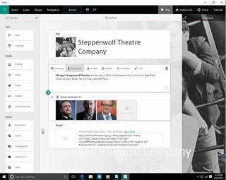
Microsoft describes Sway as a canvas you use to "paint" your ideas. The way you paint is by way of a storyboard. And in keeping with the storyboard metaphor, you drag different types of cards onto the canvas to begin laying out the way you'll tell your story. These cards appear at the left of your canvas and adding them is as simple as it sounds: click, drag, done. It's so simple that anyone of any age can drag around Sway cards with ease. You can arrange and rearrange these cards in any order you choose, but they are always in a sequence, one card following directly after the other. Want to make a change to the sequence? Drag a card up or down the canvas.

MORE: 5 Ways to Take Screenshots in Windows 10
Formatting Presentations
Sway offers two types of cards: Text and media, but the app limits what you can do with each. You can only make minor changes to the way text and images appear; instead, you format in broad generalities. Headings are emphasized and accented. Large blocks of text can additionally be bulleted or numbered. All can be linked to external URLs.

You do not choose where or how text is placed on your Sway project, a definite departure from something like PowerPoint and even a free tool such as Prezi. Likewise, images have grouping options, and you can specify what their focus point should be, but there are no specific formatting options, nor can you tell Sway exactly where to place an image. Other media links display individual tweets, charts or embedded video, with the same limitations on formatting.

In addition to these basic image and text formatting tools, you can also choose design and navigation options. Sway provides several prepackaged looks that you can tweak to match your design preferences, none of which I loved. They're good, but basic. And I found the color choices to be a little pedestrian. You'll certainly find better looks in PowerPoint or Keynote.
You can also choose how users will interact with your Sway, but, again, these are all very basic, left-to-right, up-and-down, optimized-for-presentation options. There's also a "Remix" option that automatically applies several of these design changes; you can then preview the changes and use them for your project if you want.
While these formatting options seem limited, these limits are, in a way, the magic of Sway. You create an outline for your story--in fact, Sway can import outlines you've created in Word--choose how you want your Sway to look and how you'd like users to interact with it, and Sway builds the way that story is presented to your viewers behind the scenes.
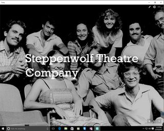
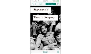
While the content of your presentation remains the same on all devices, Sway automatically adapts the way it's presented to the size of the device your viewers access it on. This auto-adaptation works quite well. Testing this on a Mac, PC, iPhone and iPad, I found that while color schemes and fonts look the same, layout changed to suit the device I was viewing the project on. For instance, a presentation viewed on an iPhone will adjust the text placement and the focal point of an image so that it looks best on that device. View that same presentation on an iPad, and the text and picture will adjust again, even as you flip the tablet into portrait or landscape. In short, projects look great no matter what device you view them on. What makes this great is that you can outline once and deliver to any and everyone who wants to view your Sway, after barely blinking an eye.

Sharing Presentations
Once you've created a presentation, Sway gives you several options for sharing it. Publish it at Microsoft's Docs.com, share it on Facebook and Twitter or add its embed code to your website. Sharing is a simple process and, frankly, a pretty phenomenal one once you see them published for the Web. I shared a Sway project via Microsoft's Docs.com, finding the process simple and immediate. On Docs.com, I moved my mouse over my Sway project and clicked the share link that appeared; I could also copy a shareable link or copy the embed code to paste the presentation on my own website.
I'd never use Sway as a professional presentation tool -- for that, stick to PowerPoint, Prezi or Keynote. But it's perfect for presentations primarily meant to be seen on the Web by friends, fans and family. Sway can easily handle things like a school project, indie band update, vacation photos or that annual holiday letter.
Performance Issues
I did run into a number of minor issues working in Sway on Windows 10, though it's difficult to ascertain whether they were related to version 1 of a new application or to the newly minted version of Windows it runs on. Most issues involved application hangs after entering Sway's Preview mode; quitting and reopening the application resolved the issue, but it did happen on a consistent basis.

I also noted that what you see in Preview mode within the Sway application and what gets published are not always exactly the same, particularly with regard to how animations appear after your presentation goes live. The published versions were much better than what I saw when creating and previewing my Sway. Animations were smoother and the way presentations flowed looked better and overall they felt more polished. For example, edits previewed within Sway were often jittery and occasionally the screen flashed before a transition loaded. But when my presentation was embedded on the Web, my Sway projects loaded smoothly and without issue.
MORE: How to Pin a Website to Windows 10's Start Menu
Bottom Line
Is Sway worth the learning curve of yet another application meant to present your personal information? Maybe. School projects, basic presentations, personal newsletters and work you want to prototype or get a quick feel for are a perfect fit for Sway. Due to its limited customization options, though, it's not what you'll want to use for your big presentation. Sway is better meant for personal work or quick and dirty presentations of your ideas that you want to have a little flair. But, for more control over how your presentation looks, I'd say Prezi has the upper hand.
Microsoft Sway for Windows 10 Specs
| Company Website | http://www.microsoft.com |
| Platforms | Windows 10 |
| Software Type | Business Software |
